数学建模-Python
规划问题
线性规划问题
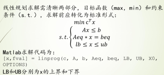
标准形式
样例1

过程
c为所求的z,[2,3,-5]
Ax≤b即,A为[[-2,5,-1][1,3,1]],b为[-10,12]
Aeq为等式左边的[1,1,1],beq为等式右边的[7]
求解参数第一个为-c(因求解c的最大值即求c的最小值),后面依次为A,b,Aeq,beq
注意:Aeq和A的维度,即[]的层数
代码
1 | # 使用scipy实现 |
     con: array([1.80713222e-09])
     fun: -14.57142856564506
 message: 'Optimization terminated successfully.'
     nit: 5
   slack: array([-2.24583019e-10,  3.85714286e+00])
  status: 0
 success: True
       x: array([6.42857143e+00, 5.71428571e-01, 2.35900788e-10])
样例2

过程
Scipy
c为所求的z,[2,3,1]
Ax≤b即,A为[[-1,-4,-2][-3-2,0]],b为[-8,-6],
Aeq为等式左边的[1,2,4],beq为等式右边的[101]
求解参数第一个为-c(因求解c的最大值即求c的最小值),后面依次为A,b,Aeq,beq
LB,UB不用设置
Pulp
定义问题maximum或者minimum
添加决策变量,离散型或者连续型
设置目标函数
添加约束
求解输出
代码
1 | # pulp库求解 |
Status: Optimal
x1 = 101.0
x2 = 0.0
x3 = 0.0
F(x) =  202.0
1 | # 使用scipy实现 |
     con: array([3.75850107e-09])
     fun: -201.9999999893402
 message: 'Optimization terminated successfully.'
     nit: 6
   slack: array([ 93.        , 296.99999998])
  status: 0
 success: True
       x: array([1.01000000e+02, 6.13324051e-10, 3.61350245e-10])
运输问题
标准形式

样例1
过程
使用pulp
定义问题,获取数据,定义目标函数,添加约束,求解输出
把二维array通过flatten折叠成一维之后方便操作
代码
1 | # 运输问题求解 |
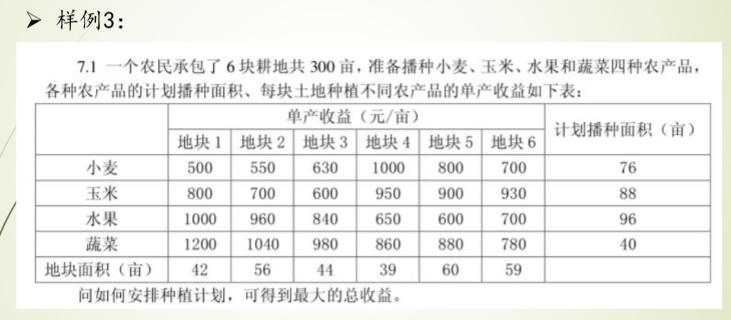
种植最大收益问题:
MAXIMIZE
500*x00 + 530*x01 + 630*x02 + 1000*x03 + 800*x04 + 700*x05 + 800*x10 + 700*x11 + 600*x12 + 950*x13 + 900*x14 + 930*x15 + 1000*x20 + 960*x21 + 840*x22 + 650*x23 + 600*x24 + 700*x25 + 1200*x30 + 1040*x31 + 980*x32 + 860*x33 + 880*x34 + 780*x35 + 0
SUBJECT TO
_C1: x00 + x01 + x02 + x03 + x04 + x05 <= 76

_C2: x10 + x11 + x12 + x13 + x14 + x15 <= 88

_C3: x20 + x21 + x22 + x23 + x24 + x25 <= 96

_C4: x30 + x31 + x32 + x33 + x34 + x35 <= 40

_C5: x00 + x10 + x20 + x30 <= 42

_C6: x01 + x11 + x21 + x31 <= 56

_C7: x02 + x12 + x22 + x32 <= 44

_C8: x03 + x13 + x23 + x33 <= 39

_C9: x04 + x14 + x24 + x34 <= 60

_C10: x05 + x15 + x25 + x35 <= 59

VARIABLES
0 <= x00 Integer
0 <= x01 Integer
0 <= x02 Integer
0 <= x03 Integer
0 <= x04 Integer
0 <= x05 Integer
0 <= x10 Integer
0 <= x11 Integer
0 <= x12 Integer
0 <= x13 Integer
0 <= x14 Integer
0 <= x15 Integer
0 <= x20 Integer
0 <= x21 Integer
0 <= x22 Integer
0 <= x23 Integer
0 <= x24 Integer
0 <= x25 Integer
0 <= x30 Integer
0 <= x31 Integer
0 <= x32 Integer
0 <= x33 Integer
0 <= x34 Integer
0 <= x35 Integer

优化状态: Optimal
x00 = 0.0
x01 = 0.0
x02 = 6.0
x03 = 39.0
x04 = 31.0
x05 = 0.0
x10 = 0.0
x11 = 0.0
x12 = 0.0
x13 = 0.0
x14 = 29.0
x15 = 59.0
x20 = 2.0
x21 = 56.0
x22 = 38.0
x23 = 0.0
x24 = 0.0
x25 = 0.0
x30 = 40.0
x31 = 0.0
x32 = 0.0
x33 = 0.0
x34 = 0.0
x35 = 0.0
最优收益 =  284230.0
整数规划(有待完善)

非线性规划
样例1

过程
使用scipy.optimize中的minimize求得局部最小值
代码
1 | # 求x+1/x的最小值 |
2.0000000815356342
True
[1.00028559]
样例2

过程
定义表达式
定义约束条件(eq和ineq)
代码
1 | # 定义表达式 |
-0.773684210526435
True
[0.9 0.9 0.1]
微分方程解析解
一个例子
1 | from sympy.abc import * |
1 | diffeq |
\(\displaystyle f{\left(x \right)} + \frac{d^{2}}{d x^{2}} f{\left(x \right)} = \sin{\left(x \right)}\)
1 | dsolve(diffeq,f(x)) |
\(\displaystyle f{\left(x \right)} = C_{2} \sin{\left(x \right)} + \left(C_{1} - \frac{x}{2}\right) \cos{\left(x \right)}\)
阻尼谐振子的二阶ODE
包含initial conditions
1 | t,gamma,omega0=symbols('t,gamma,omega_0') # 定义符号 |
\(\displaystyle x{\left(t \right)} = \left(- \frac{\gamma}{2 \sqrt{\gamma^{2} - 1}} + \frac{1}{2}\right) e^{\omega_{0} t \left(- \gamma - \sqrt{\gamma^{2} - 1}\right)} + \left(\frac{\gamma}{2 \sqrt{\gamma^{2} - 1}} + \frac{1}{2}\right) e^{\omega_{0} t \left(- \gamma + \sqrt{\gamma^{2} - 1}\right)}\)
微分方程数值解
场线图与数值解
当ODE无法求得解析解时,可以用scipy中的intergrate.odeint求数值解来探索其解的部分性质,并辅以可视化,能直观的展现ODE解的函数表达
以如下一阶非线性ODE为例
1 | from scipy import integrate |
1 | x =sympy.symbols('x') |
\(\displaystyle \frac{d}{d x} y{\left(x \right)} = x - y^{2}{\left(x \right)}\)
先尝试用dsolve解决
1 | dsolve(diffeq) |
\(\displaystyle y{\left(x \right)} = \frac{x^{2} \left(2 C_{1}^{3} + 1\right)}{2} + \frac{x^{5} \left(- 10 C_{1}^{3} \left(6 C_{1}^{3} + 1\right) - 20 C_{1}^{3} - 3\right)}{60} + C_{1} + \frac{C_{1} x^{3} \left(- 3 C_{1}^{3} - 1\right)}{3} - C_{1}^{2} x + \frac{C_{1}^{2} x^{4} \left(12 C_{1}^{3} + 5\right)}{12} + O\left(x^{6}\right)\)
现用odeint求其数值解
odeint()函数是scipy库中一个数值求解微分方程的函数 odeint()函数需要至少三个变量,第一个是微分方程函数,第二个是微分方程初值,第三个是微分的自变量
1 | def diff(y, x): |
场线图的画法暂时没看懂
1 | # 一个例子 |
洛伦兹曲线与数值解
代码例
1 | def move(P,steps,sets): |
使用odeint解决
1 | # 定义函数 |
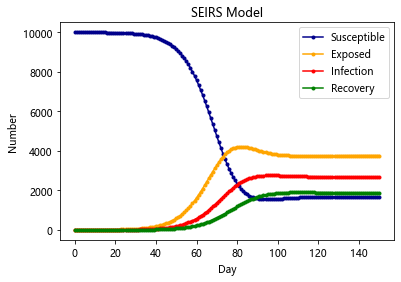
传染病模型
六种传染病模型 SI,SIS,SIR,SIRS,SEIR,SEIRS
艾滋传染模型 SI
普通流感模型 SIS
急性传染病模型 SIR 及其拓展模型 SIRS
带潜伏期的恶性传染病模型 SEIR
SI-Model
在 SI 模型里面,只考虑了易感者和感染者,并且感染者不能够恢复,此类病症有 HIV 等; 由于艾滋传染之后不可治愈,所以该模型为:易感染者被感染
最简单的SI模型首先把人群分为2种,一种是易感者(Susceptibles),易感者是健康的人群,用S表示其人数,另外一种是感染者(The
Infected),人数用 I来表示
假设:
1、在疾病传播期间总人数N不变,N=S+I
2、每个病人每天接触人数为定值
1 | import scipy.integrate as spi |
SIS-Model
除了 HIV 这种比较严重的病之外,还有很多小病是可以恢复并且反复感染的,例如日常的感冒,发烧等。在这种情况下,感染者就有一定的几率重新转化成易感者
在SI模型基础上加入康复的概率
1 | import scipy.integrate as spi |
SIR-Model
有的时候,感染者在康复之后,就有了抗体,于是后续就不会再获得此类病症,这种时候,考虑SIS模型就不再合适了,需要考虑SIR模型。此类病症有麻疹,腮腺炎,风疹等
SIR是三个单词首字母的缩写,其中S是Susceptible的缩写,表示易感者;I是Infective的缩写,表示感染者;R是Removal的缩写,表示移除者。这个模型本身是在研究这三者的关系。在病毒最开始的时候,所有人都是易感者,也就是所有人都有可能中病毒;当一部分人在接触到病毒以后中病毒了,变成了感染者;感染者会接受各种治疗,最后变成了移除者。
该模型有两个假设条件
1.一段时间内总人数N是不变的,也就是不考虑新生以及自然死亡的人数
2.从S到I的变化速度α、从I到R的变化速度β也是保持不变的
3.移除者不再被感染
1 | import scipy.integrate as spi |
SEIR-Model(更加贴合新冠)
SEIR模型加入了扰动因子v,前面三种模型也可以加入扰动因子,加入扰动因子的模型往往更合理
原因:就拿SEIR模型来说,它不是万能的,总有一些异常状况,如有的人潜伏期短,有的人潜伏期长,还可能有超级感染者,有的潜伏者可能就直接痊愈了,变成了抵抗者。方程并没有单独处理这些情况,因为一定程度内这些异类都可以被扰动因子所包含。研究一个固定的模型加扰动项,比不断地往模型里加扰动项好研究的多
通过对 SEIR 模型的研究, 可以预测一个封闭地区疫情的爆发情况, 最大峰值, 感染人数等等 但是显然没有任何地区是封闭的, 所以就要把各个地区看成图的节点, 地区之间的流动可以由马尔可夫转移所刻画, 对每个结点单独跑 SEIR 模型
最后整个仿真模型就可以比较准确的反应疫情的散播和爆发情况
当然可以再加入更多的决策因素
在其他模型的基础上,加入传染病潜伏期的存在
1 | import scipy.integrate as spi |
SIRS-Model
与SIR不同在于,康复者的免疫力是暂时的,康复者会转化为易感者
1 | import scipy.integrate as spi |
SIERS-Model
同时有潜伏期且免疫暂时的条件
1 | import scipy.integrate as spi |
数值逼近问题
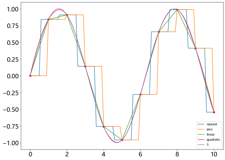
一维插值
线性插值与样条插值
样例1

代码
1 | import numpy as np |
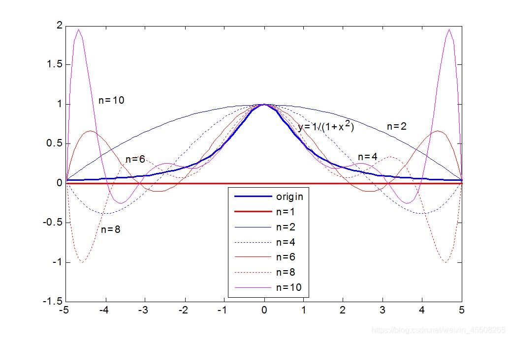
高阶样条插值
随着插值节点增多,多项式次数也增高,插值曲线在一些区域出现跳跃,并且越来越偏离原始曲线,1901 年被发现并命名为 Tolmé Runge 现象。也就是龙格现象
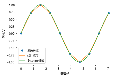
样例2
某电学元件的电压数据记录在 0~10A 范围与电流关系满足正弦函数,分别用 0-5 阶样条插值方法给出经过数据点的数值逼近函数曲线
1 | # 创建数据点集 |
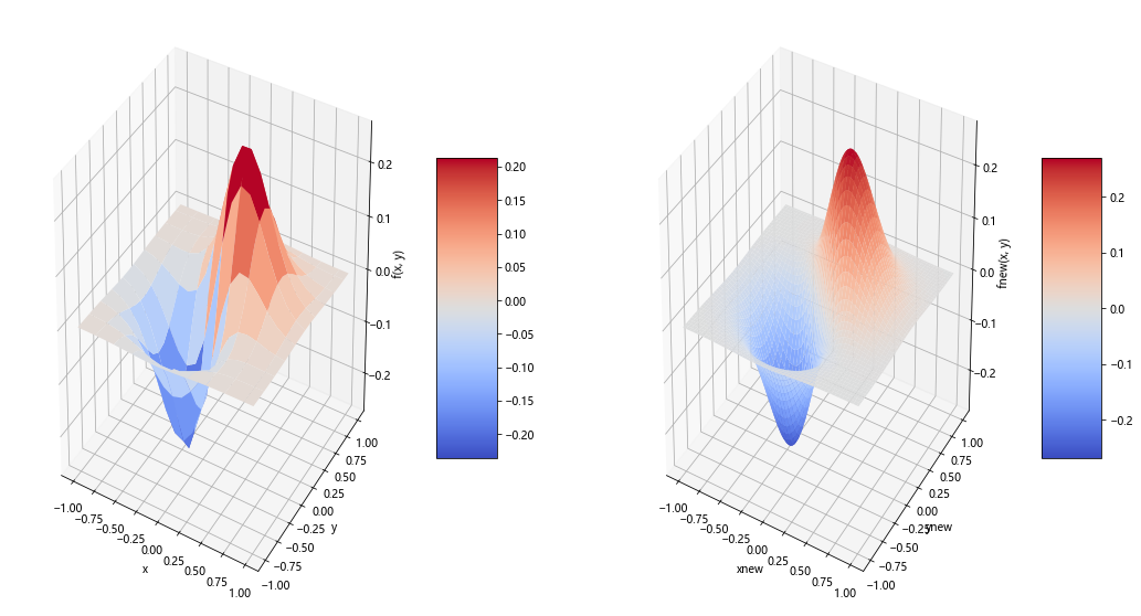
二维插值
图像模糊处理–样条插值
样例1

代码
1 | import numpy as np |
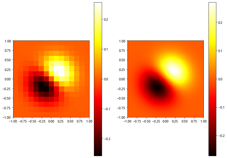
二维插值的三维图
样例2

rstride 行跨度
cstride 列跨度
antialised 锯齿效果
代码
1 | import numpy as np |
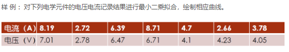
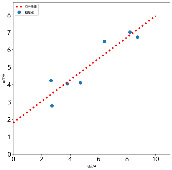
OLS拟合
- 拟合指的是已知某函数的若干离散函数值 {f1, fn 通过调整该函数中若干待定系数 f(λ1, λ2,…, λn 使得该函数与已知点集的差别 (最小二乘意义) 最小。
- 如果待定函数是线性,就叫线性拟合或者线性回归 主要在统计中否则叫作非线性拟合或者非线性回归。表达式也可以是分段函数,这种情况下叫作样条拟合。
- 从几何意义上讲,拟合是给定了空间中的一些点,找到一个已知形式未知参数的连续曲面来最大限度地逼近这些点;而插值是找到一个( 或几个分片光滑的 连续-曲面来穿过这些点。
- 选择参数 c 使得拟合模型与实际观测值在曲线拟合各点的残差 或离差 ek = yk - f( xk,c) 的加权平方和达到最小 此时所求曲线称作在加权最小二乘意义下对数据的拟合曲线 这种方法叫做 最小二乘法 。
样例1
代码
1 | import numpy as np |
差分方程问题
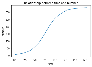
递推关系-酵母菌生长模型
差分方程建模的关键在于如何得到第n组数据与第n+1组数据之间的关系
如图所示我们用培养基培养细菌时,其数量变化通常会经历这四个时期
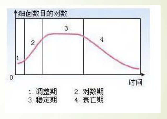
这个模型针对前三个时期建一个大致的模型:
- 调整期
- 对数期
- 稳定期
根据已有的数据进行绘图:
1 | import matplotlib.pyplot as plt |
分析:
酵母菌数量增长有一个这样的规律:当某些资源只能支撑某个最大限度的种群 数量,而不能支持种群数量的无限增长,当接近这个最大值时,种群数量的增 长速度就会慢下来。
两个观测点的值差△p来表征增长速度 △p与目前的种群数量有关,数量越大,增长速度越快 △p还与剩余的未分配的资源量有关,资源越多,增长速度越快 然后以极限总群数量与现有种群数量的差值表征剩余资源量
模型:
当把该式子看成二次曲线进行拟合时:
1 | import numpy as np |
[-8.01975671e-04 5.16054679e-01 6.41123361e+00]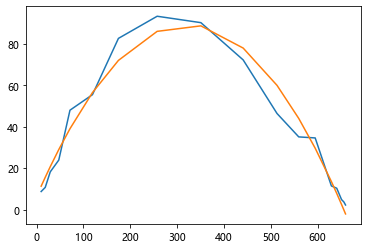
当看成一次曲线进行拟合时
将 (665 - pn) * pn 看出一个整体 那么整个式子就是一个一次函数
1 | import numpy as np |
[ 0.00081448 -0.30791574]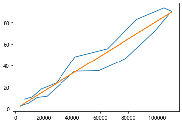
预测曲线
1 | import matplotlib.pyplot as plt |
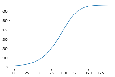
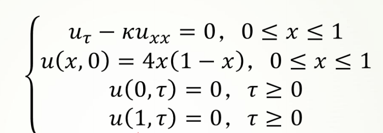
显示差分-热传导方程
一维热传导方程为:
其中,k为热传导系数,第2式是方程的初值条件,第3、4式是边值条件,热传导方程如下:
1 | import numpy as np |
长度等分成10份
时间等分成10份
网格比= 10.0
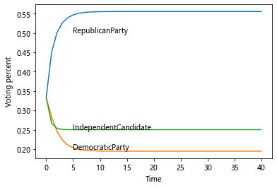
运行时间为 0:00:00.048869马尔科夫链-选举投票预测
马尔科夫链是由具有以下性质的一系列事件构成的过程:
- 一个事件有有限多个结果,称为状态,该过程总是这些状态中的一个;
- 在过程的每个阶段或者时段,一个特定的结果可以从它现在的状态转移到任 何状态,或者保持原状;
- 每个阶段从一个状态转移到其他状态的概率用一个转移矩阵表示,矩阵每行 的各元素在0到1之间,每行的和为1。
实例:选举投票预测
- 以美国大选为例,首先取得过去十次选举的历史数据,然后根据历史数据得到 选民意向的转移矩阵。
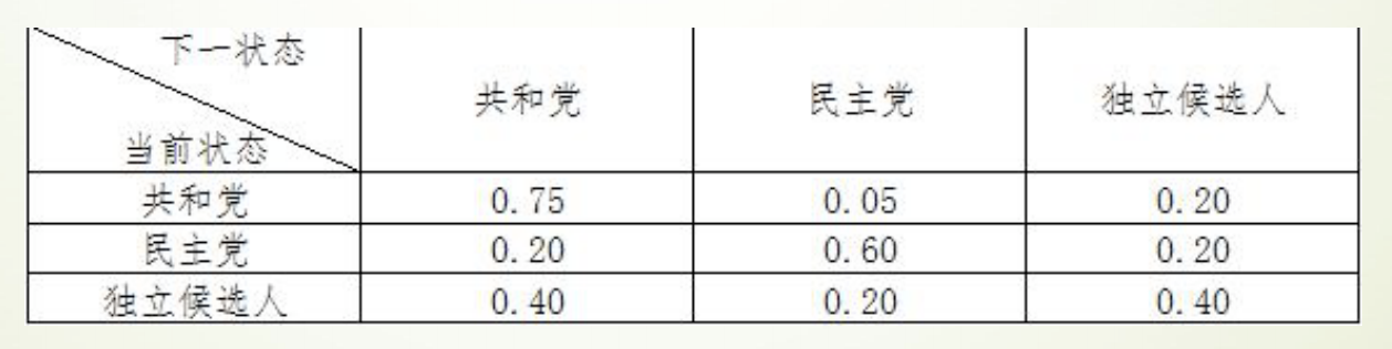
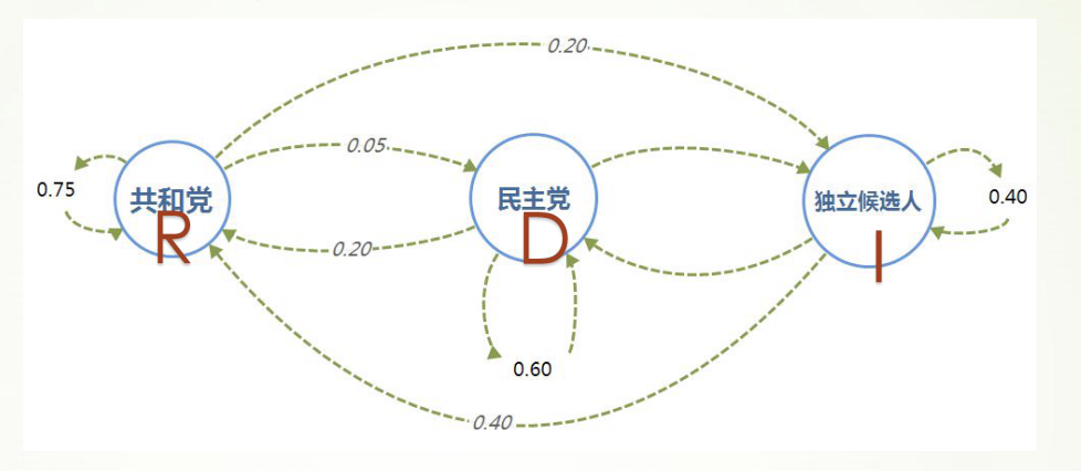
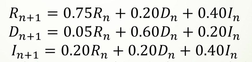
于是可以通过求解差分方程组,推测出选民投票意向的长期趋势
代码
1 | import matplotlib.pyplot as plt |
[0.5555499999214578, 0.555549999956802, 0.5555499999762412, 0.5555499999869329]
[0.19444250007854258, 0.19444250004319846, 0.1944425000237592, 0.19444250001306762]
[0.24999750000000015, 0.24999750000000015, 0.24999750000000015, 0.24999750000000015]
最后得到的长期趋势是:
- 55.55%的人选共和党
- 19.44%的人选民主党
- 25.00%的人选独立候选人
C-K方程求解
1 | import numpy as np |
[[0.55557261 0.19445041 0.25000767]
 [0.55557261 0.19445041 0.25000767]
 [0.55557261 0.19445041 0.25000767]]
图论
图论是什么
图论〔Graph Theory〕以图为研究对象,是离散数学的重要内容。图论不仅与拓扑学、计算机数据结构和算法密切相关,而且正在成为机器学习的关键技术。
图论中所说的图,不是指图形图像(image)或地图(map),而是指由顶点(vertex)和连接顶点的边(edge)所构成的关系结构。
图提供了一种处理关系和交互等抽象概念的更好的方法,它还提供了直观的视觉方式来思考这些概念。
NetworkX 工具包
NetworkX 是基于 Python 语言的图论与复杂网络工具包,用于创建、操作和研究复杂网络的结构、动力学和功能。
NetworkX 可以以标准和非标准的数据格式描述图与网络,生成图与网络,分析网络结构,构建网络模型,设计网络算法,绘制网络图形。
NetworkX 提供了图形的类、对象、图形生成器、网络生成器、绘图工具,内置了常用的图论和网络分析算法,可以进行图和网络的建模、分析和仿真。
NetworkX 的功能非常强大和庞杂,所涉及内容远远、远远地超出了数学建模的范围,甚至于很难进行系统的概括。本系列结合数学建模的应用需求,来介绍 NetworkX 图论与复杂网络工具包的基本功能和典型算法。
图、顶点和边的创建与基本操作
图由顶点和连接顶点的边构成,但与顶点的位置、边的曲直长短无关。
Networkx 支持创建简单无向图、有向图和多重图;内置许多标准的图论算法,节点可为任意数据;支持任意的边值维度,功能丰富,简单易用。
图的基本概念
- 图(Graph):图是由若干顶点和连接顶点的边所构成关系结构。
- 顶点(Node):图中的点称为顶点,也称节点。
- 边(Edge):顶点之间的连线,称为边。
- 平行边(Parallel edge):起点相同、终点也相同的两条边称为平行边。
- 循环(Cycle):起点和终点重合的边称为循环。
- 有向图(Digraph):图中的每条边都带有方向,称为有向图。
- 无向图(Undirected graph):图中的每条边都没有方向,称为无向图。
- 赋权图(Weighted graph):图中的每条边都有一个或多个对应的参数,称为赋权图。该参数称为- 这条边的权,权可以用来表示两点间的距离、时间、费用。
- 度(Degree):与顶点相连的边的数量,称为该顶点的度。
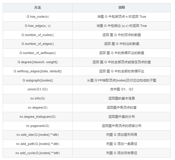
图、顶点和边的操作
Networkx很容易创建图、向图中添加顶点和边、从图中删除顶点和边,也可以查看、删除顶点和边的属性。
图的创建
Graph() 类、DiGraph() 类、MultiGraph() 类和 MultiDiGraph() 类分别用来创建:无向图、有向图、多图和有向多图。定义和例程如下:
class Graph(incoming_graph_data=None, **attr)
1 | import networkx as nx # 导入 NetworkX 工具包 |
顶点的添加、删除和查看
图的每个顶点都有唯一的标签属性(label),可以用整数或字符类型表示,顶点还可以自定义任意属性。
顶点的常用操作:添加顶点,删除顶点,定义顶点属性,查看顶点和顶点属性。定义和例程如下:
Graph.add_node(node_for_adding, **attr)
Graph.add_nodes_from(nodes_for_adding, **attr)
Graph.remove_node(n)
Graph.remove_nodes_from(nodes)
1 | # 顶点(node)的操作 |
[1, 2, 3, 0, 6, 10, 11, 12, 13, 14]
{1: {'name': 'n1', 'weight': 1.0}, 2: {'date': 'May-16'}, 3: {'dist': 1}, 0: {'dist': 1}, 6: {'dist': 1}, 10: {}, 11: {}, 12: {}, 13: {}, 14: {}}
[2, 3, 0, 6, 10, 12]
边的添加、删除和查看
边是两个顶点之间的连接,在 NetworkX 中 边是由对应顶点的名字的元组组成 e=(node1,node2)。边可以设置权重、关系等属性。
边的常用操作:添加边,删除边,定义边的属性,查看边和边的属性。向图中添加边时,如果边的顶点是图中不存在的,则自动向图中添加该顶点。
Graph.add_edge(u_of_edge, v_of_edge, **attr)
Graph.add_edges_from(ebunch_to_add, **attr)
Graph.add_weighted_edges_from(ebunch_to_add, weight=‘weight’, **attr)
1 | # 边(edge)的操作 |
[2, 3, 0, 6, 10, 12, 1, 5, 7]
[(2, 1), (3, 6), (0, 10), (6, 12), (10, 5)]
{'weight': 3.6}
{'weight': 3.6}
[(2, 1, {'weight': 3.6}), (3, 6, {}), (0, 10, {'weight': 2.7}), (6, 12, {'weight': 0.5}), (10, 5, {})]
查看图、顶点和边的信息
1 | # 查看图、顶点和边的信息 |
[2, 3, 0, 6, 10, 12, 1, 5, 7]
[(2, 1), (3, 6), (0, 10), (6, 12), (10, 5)]
[(2, 1), (3, 1), (0, 1), (6, 2), (10, 2), (12, 1), (1, 1), (5, 1), (7, 0)]
9
5
{0: {'weight': 2.7}, 5: {}}
{0: {'weight': 2.7}, 5: {}}
{'weight': 3.6}
{'weight': 3.6}
2
nx.info: Name:
Type: Graph
Number of nodes: 9
Number of edges: 5
Average degree:   1.1111
nx.degree: [(2, 1), (3, 1), (0, 1), (6, 2), (10, 2), (12, 1), (1, 1), (5, 1), (7, 0)]
nx.density: [1, 6, 2]
nx.pagerank: {2: 0.1226993865030675, 3: 0.11988128948774181, 0: 0.1294804066578225, 6: 0.17907377128985963, 10: 0.17907377128985968, 12: 0.06914309873160096, 1: 0.1226993865030675, 5: 0.059543981561520264, 7: 0.018404907975460127}
图的属性和方法
图的方法
图的绘制与分析
图的绘制
可视化是图论和网络问题中很重要的内容。NetworkX 在 Matplotlib、Graphviz 等图形工具包的基础上,提供了丰富的绘图功能。
本系列拟对图和网络的可视化作一个专题,在此只简单介绍基于 Matplotlib
的基本绘图函数。基本绘图函数使用字典提供的位置将节点放置在散点图上,或者使用布局函数计算位置。
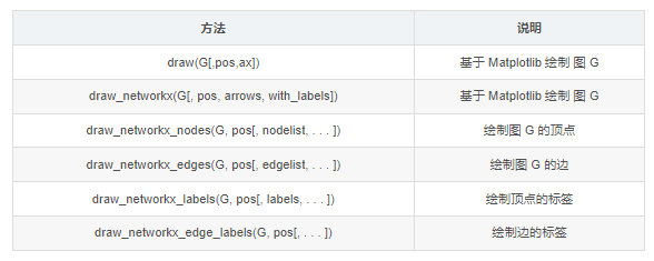
其中,nx.draw() 和 nx.draw_networkx() 是最基本的绘图函数,并可以通过自定义函数属性或其它绘图函数设置不同的绘图要求。
draw(G, pos=None, ax=None, **kwds)
draw_networkx(G, pos=None, arrows=True, with_labels=True, **kwds)
常用的属性定义如下:
- ‘node_size’:指定节点的尺寸大小,默认300
- ‘node_color’:指定节点的颜色,默认红色
- ‘node_shape’:节点的形状,默认圆形
- ‘alpha’:透明度,默认1.0,不透明
- ‘width’:边的宽度,默认1.0
- ‘edge_color’:边的颜色,默认黑色
- ‘style’:边的样式,可选 ‘solid’、‘dashed’、‘dotted’、‘dashdot’
- ‘with_labels’:节点是否带标签,默认True
- ‘font_size’:节点标签字体大小,默认12
- ‘font_color’:节点标签字体颜色,默认黑色
图的分析
NetwotkX 提供了图论函数对图的结构进行分析:
子图
- 子图是指顶点和边都分别是图 G 的顶点的子集和边的子集的图。
- subgraph()方法,按顶点从图 G 中抽出子图。例程如前。
连通子图
- 如果图 G 中的任意两点间相互连通,则 G 是连通图。
- connected_components()方法,返回连通子图的集合。
1 | G = nx.path_graph(4) |
Connected components:[4, 3]
Largest connected components:{0, 1, 2, 3}
回归问题
线性回归分析
Python固定导入的包
1 | # 工具:python3 |
numpy_1.20.1
pandas_1.2.4
matplotlib_3.2.2
线性回归
Y= aX + b + e ,e表示残差
线性回归:分析结论的前提:数据满足统计假设
- 正态性:预测变量固定时,因变量正态分布
- 独立性:因变量互相独立
- 线性:因变量与自变量线性(残差白噪声)
- 同方差性:残差方差均匀
scipy.optimize.curve_fit():回归函数拟合
1 | from scipy.optimize import curve_fit #回归函数拟合包 |
(array([  28.03191489, 2011.17021277]), array([[     18.16149846,   -5837.62445922],
       [  -5837.62445922, 2224783.5263512 ]]))
scipy.stats.linregress(): 线性拟合
1 | from scipy import stats #线性回归包 |
LinregressResult(slope=28.03191489361702, intercept=2011.1702127659555, rvalue=0.9467887456768281, pvalue=0.0012189021752212815, stderr=4.261630957224319, intercept_stderr=1491.5708350285115)statsmodels.formula.api.OLS():普通最小二乘模型拟合- - 常用
1 | np.random.seed(123456789) |
                            OLS Regression Results
==============================================================================
Dep. Variable:                      y   R-squared:                       0.380
Model:                            OLS   Adj. R-squared:                  0.367
Method:                 Least Squares   F-statistic:                     29.76
Date:                Sun, 17 Oct 2021   Prob (F-statistic):           8.36e-11
Time:                        22:28:41   Log-Likelihood:                -271.52
No. Observations:                 100   AIC:                             549.0
Df Residuals:                      97   BIC:                             556.9
Df Model:                           2
Covariance Type:            nonrobust
==============================================================================
                 coef    std err          t      P>|t|      [0.025      0.975]
------------------------------------------------------------------------------
Intercept      0.9868      0.382      2.581      0.011       0.228       1.746
x1             1.0810      0.391      2.766      0.007       0.305       1.857
x2             3.0793      0.432      7.134      0.000       2.223       3.936
==============================================================================
Omnibus:                       19.951   Durbin-Watson:                   1.682
Prob(Omnibus):                  0.000   Jarque-Bera (JB):               49.964
Skew:                          -0.660   Prob(JB):                     1.41e-11
Kurtosis:                       6.201   Cond. No.                         1.32
==============================================================================

Notes:
[1] Standard Errors assume that the covariance matrix of the errors is correctly specified.
回归诊断流程

1 | import numpy as np |
1 | # 相关度 |
可见自变量lstat与因变量medv强负相关,自变量rm与因变量medv强正相关
1 | # 自变量 |
| 0 | 1 | 2 | 3 | 4 | |
|---|---|---|---|---|---|
| BayesianRidge | 0.592068 | 0.647307 | 0.264133 | 0.149150 | -0.648919 |
| LinearRegression | 0.601070 | 0.651541 | 0.308329 | 0.142842 | -0.672901 |
| ElasticNet | 0.382249 | 0.552730 | 0.003601 | 0.421609 | -0.077382 |
| SVR | 0.617085 | 0.520500 | -0.301541 | 0.473345 | 0.266060 |
| GBR | 0.356270 | 0.815895 | 0.562909 | 0.512857 | 0.060558 |
1 | # 各种评估结果 |
| ev | mae | mse | r2 | |
|---|---|---|---|---|
| BayesianRidge | 0.634281 | 3.895336 | 30.683785 | 0.634281 |
| LinearRegression | 0.634334 | 3.888380 | 30.679309 | 0.634334 |
| ElasticNet | 0.586648 | 4.213199 | 34.680158 | 0.586648 |
| SVR | 0.628395 | 3.701105 | 32.394854 | 0.613886 |
| GBR | 0.934846 | 1.716812 | 5.466391 | 0.934846 |
1 | ### 可视化 ### |
以上可见梯度增强回归(GBR)是所有模型中拟合效果最好的
评估指标解释:
- explained_variance_score:解释回归模型的方差得分,其值取值范围是[0,1],越接近于1说明自变量越能解释因变量的方差变化,值越小则说明效果越差。
- mean_absolute_error:平均绝对误差(Mean Absolute Error, MAE),用于评估预测结果和真实数据集的接近程度的程度,其值越小说明拟合效果越好。
- mean_squared_error:均方差(Mean squared error, MSE),该指标计算的是拟合数据和原始数据对应样本点的误差的平方和的均值,其值越小说明拟合效果越好。
- r2_score:判定系数,其含义是也是解释回归模型的方差得分,其值取值范围是[0,1],越接近于1说明自变量越能解释因变量的方差变化,值越小则说明效果越差。
logistic回归
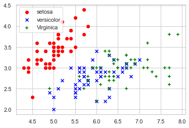
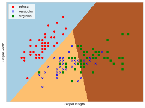
鸢尾花数据集
鸢尾花有三个亚属,分别是山鸢尾(Iris-setosa)、变色鸢尾(Iris- versicolor)和维吉尼亚鸢尾(Iris-virginica)。
该数据集一共包含4个特 征变量,1个类别变量。共有150个样本,iris是鸢尾植物,这里存储了其萼片 和花瓣的长宽,共4个属性,鸢尾植物分三类。
绘制散点图
1 | import matplotlib.pyplot as plt |
逻辑回归分析
1 | from sklearn.linear_model import LogisticRegression |
蒙特卡洛算法
基本思想
当所求解问题是某种随机事件出现的概率,或者是某个随机变量的期望值时,通过某种“实验”的方法,以这种事件出现的频率估计这一随机事件的概率,或者得到这个随机变量的某些数字特征,并将其作为问题的解。
工作步骤:
构造或描述概率过程
实现从已知概率分布抽样
建立各种估计量
样例1
题目:经典的蒙特卡洛方法求圆周率
基本思想:在图中区域产生足够多的随机数点,然后计算落在圆内的点的个数与总个数的比值再乘以4,就是圆周率。
代码
模拟10000,100000,10000000次
1 | import math |
pi = 3.1456
pi = 3.13804
pi = 3.140816
样例2
计算函数y = x^2在[0,1]区间的定积分
代码
1 | import matplotlib.pyplot as plt |
r = 0.33264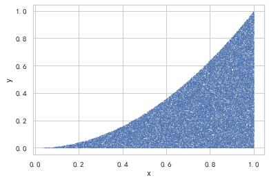
样例3
变式:计算积分
代码
绘制函数图像
1 | import numpy as np |
计算积分
1 | import numpy as np |
实验值 = 0.272536
理论值 = 0.27219826128795027
样例4
现在有个项目,共三个WBS要素,分别是设计、建造和测试
假设这三个WBS要素预估工期的概率分布呈标准正态分布,且三者之间都是完成到开始的逻辑关系
于是整个项目工期就是三个WBS要素工期之和
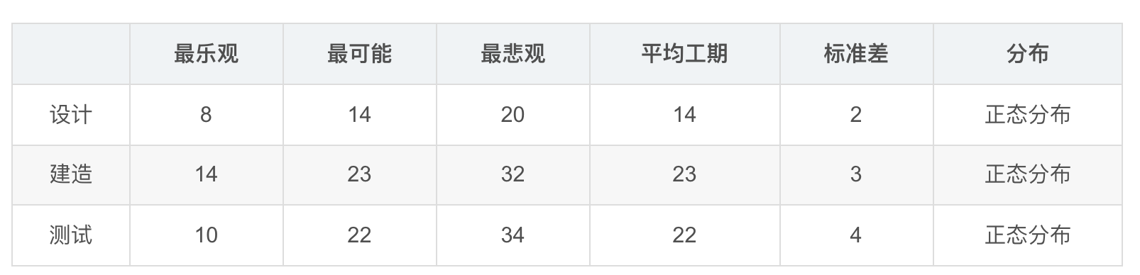
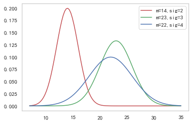
首先,先画出这三个要素的概率密度函数
从表中可以看出 时间最少为8天 最长为34天 所以我们设置时间范围为7-35 天
代码
1 | import numpy as np |
\[ \displaystyle \mathrm{NormalDistribution}(x, mean, {\sigma})\triangleq \frac{\mathrm{np.exp}\left(\frac{-1(x - mean)^{2}}{2{\sigma}^{2}}\right)}{\sqrt{2np.pi}{\sigma}} \]
1 | import numpy as np |
实验值:
 59.092510534230925 28.867667234563722
理论值:
均值为59 = 14 + 23 + 22
方差为29 = 2*2 + 3*3 + 4*4
三门问题
简介
三门问题(Monty Hall probelm)亦称为蒙提霍尔问题,出自美国电视游戏节目Let’s Make a Deal。
参赛者会看见三扇关闭了的门,其中一扇的后面有一辆汽车,选中后面有车的那扇门可赢得该汽车,另外两扇门则各藏有一只山羊。
当参赛者选定了一扇门,但未去开启它的时候,节目主持人开启剩下两扇门的其中一扇,露出其中一只山羊。主持人其后问参赛者要不要换另一扇仍然关上的门。
问题是:换另一扇门是否会增加参赛者赢得汽车的几率?如果严格按照上述条件,即主持人清楚地知道,自己打开的那扇门后面是羊,那么答案是会。不换门的话,赢得汽车的几率是1/3,,换门的话,赢得汽车的几率是2/3
蒙特卡洛思想的应用
应用蒙特卡洛重点在使用随机数来模拟类似于赌博问题的赢率问题,并且通过多次模拟得到所要计算值的模拟值。
在三门问题中,用0、1、2分代表三扇门的编号,在[0,2]之间随机生成一个整数代表奖品所在门的编号prize,再次在[0,2]之间随机生成一个整数代表参赛者所选择的门的编号guess。用变量change代表游戏中的换门(true)与不换门(false)
蒙特卡洛过程

代码
1 | import math |
每次换门的中奖概率:
中奖率为0.666426
每次都不换门的中奖概率:
中奖率为0.333371
M*M豆问题
简介
M*M豆贝叶斯统计问题
M&M豆是有各种颜色的糖果巧克力豆。制造M&M豆的Mars公司会不时变更不同颜色巧克力豆之间的混合比例。
1995年,他们推出了蓝色的M&M豆。在此前一袋普通的M&M豆中,颜色的搭配为:30%褐色,20%黄色,20%红色,10%绿色,10%橙色,10%黄褐色。这之后变成了:24%蓝色,20%绿色,16%橙色,14%黄色,13%红色,13%褐色。
假设我的一个朋友有两袋M&M豆,他告诉我一袋是1994年,一带是1996年。
但他没告诉我具体那个袋子是哪一年的,他从每个袋子里各取了一个M&M豆给我。一个是黄色,一个是绿色的。那么黄色豆来自1994年的袋子的概率是多少?
代码
1 | import time |
2021-10-17 22:28:58
0.7416881216544111 0.7407407407407407 delta = 0.0009473809136704148
2021-10-17 22:28:59
0.7407544515603598 0.7407407407407407 delta = 1.3710819619094927e-05
2021-10-17 22:29:00
0.7404688828902118 0.7407407407407407 delta = -0.000271857850528856
2021-10-17 22:29:01
0.7417392429873708 0.7407407407407407 delta = 0.0009985022466301174
2021-10-17 22:29:02
0.7426368371299883 0.7407407407407407 delta = 0.0018960963892475924
2021-10-17 22:29:03
0.7396181561548176 0.7407407407407407 delta = -0.0011225845859230699
2021-10-17 22:29:04
0.7407215541165587 0.7407407407407407 delta = -1.9186624181988243e-05
2021-10-17 22:29:05
0.7407250018476091 0.7407407407407407 delta = -1.5738893131556075e-05
2021-10-17 22:29:06
0.7417678601042953 0.7407407407407407 delta = 0.001027119363554596
2021-10-17 22:29:07
0.739666276889953 0.7407407407407407 delta = -0.001074463850787688
补充(有待完善)
最后补充一些LaTeX公式在Python中的写法
@latexify.with_latex #特定语法,表示之后定义的函数可以转化为LaTeX代码
def f(x,y,z): #包含的参数
pass #此处填写可能需要的数学表达式

return result #也可以直接体现数学关系

print(f) #print(函数名)
首先,导入需要的库(math,latexify)
核心,在需要转变的数学表达式写在自定义函数中,并在之前加上特有语法
@latexify.with_latex
在print()函数中加入函数名,即可在输出区得到需要的LaTeX数学表达式
特别说明,生成的表达式为定义式,如果只需要等式,可以把生成表达式中的triangleq改成=
说明:为了不在LaTeX编译时报错,故不输出公式
(注释后仍然报错,暂未知原因)
例1 根式
1 | import latexify #引入latexify模块 |
\mathrm{solve}(a, b, c)\triangleq \frac{-b + \sqrt{b^{2} - 4ac}}{2a}\[ \displaystyle \mathrm{solve}(a, b, c)\triangleq \frac{-b + \sqrt{b^{2} - 4ac}}{2a} \]
将得到的式子中的triangeleq改为=,可以得到等式(在LaTeX中可用,暂不知如何在Python控制台输出)
例2 分段函数
1 |
|
\mathrm{sinc}(x)\triangleq \left\{ \begin{array}{ll} 1, & \mathrm{if} \ x=0 \\ \frac{\sin{\left({x}\right)}}{x}, & \mathrm{otherwise} \end{array} \right.\[ \displaystyle \mathrm{sinc}(x)\triangleq \left\{ \begin{array}{ll} 1, & \mathrm{if} \ x=0 \\ \frac{\sin{\left({x}\right)}}{x}, & \mathrm{otherwise} \end{array} \right. \]
1 |
|
\mathrm{fib}(x)\triangleq \left\{ \begin{array}{ll} 1, & \mathrm{if} \ x=0 \\ 1, & \mathrm{if} \ x=1 \\ \mathrm{fib}\left(x - 1\right) + \mathrm{fib}\left(x - 2\right), & \mathrm{otherwise} \end{array} \right.\[ \displaystyle \mathrm{fib}(x)\triangleq \left\{ \begin{array}{ll} 1, & \mathrm{if} \ x=0 \\ 1, & \mathrm{if} \ x=1 \\ \mathrm{fib}\left(x - 1\right) + \mathrm{fib}\left(x - 2\right), & \mathrm{otherwise} \end{array} \right. \]
例3 对数
1 | import math |
\mathrm{f}(x, y)\triangleq \log_{2}{\left({x + y}\right)}\[ \displaystyle \mathrm{f}(x, y)\triangleq \log_{2}{\left({x + y}\right)} \]
例4 绝对值
1 | import math |
\mathrm{f}(x)\triangleq \left|{x}\right|\[ \displaystyle \mathrm{f}(x)\triangleq \left|{x}\right| \]
例5 希腊字母
1 |
|
\mathrm{f_3}({\alpha}, {\beta}, {\gamma}, {\Omega})\triangleq {\alpha}{\beta} + \Gamma\left({{\gamma}}\right) + {\Omega}\[ \displaystyle \mathrm{f_3}({\alpha}, {\beta}, {\gamma}, {\Omega})\triangleq {\alpha}{\beta} + \Gamma\left(\right) + {\Omega} \]
1 |
|
\mathrm{f_4}(x, y)\triangleq A\mathrm{cos}\left({\omega}{\pi}x\right) + B\mathrm{sin}\left({\mu}{\pi}y\right)\[ \displaystyle \mathrm{f_4}(x, y)\triangleq A\mathrm{cos}\left({\omega}{\pi}x\right) + B\mathrm{sin}\left({\mu}{\pi}y\right) \]
时间序列问题
- 时间戳(timestamp)
- 固定周期(period)
- 时间间隔(interval)
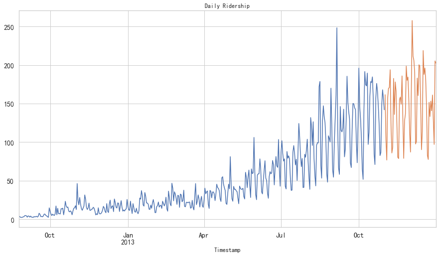
JetRail高铁乘客量预测——7种时间序列方法
内容简介
时间序列预测在日常分析中常会用到,是重要的时序数据处理方法。
高铁客运量预测
假设要解决一个时序问题:根据过往两年的数据(2012 年 8 月至 2014 年 8月),需要用这些数据预测接下来 7 个月的乘客数量。
数据获取:获得2012-2014两年每小时乘客数量
1 | import pandas as pd |
   ID          Datetime  Count
0   0  25-08-2012 00:00      8
1   1  25-08-2012 01:00      2
2   2  25-08-2012 02:00      6
3   3  25-08-2012 03:00      2
4   4  25-08-2012 04:00      2
(18288, 3)
数据集处理:(以每天为单位构造和聚合数据集)
- 从2012年8月—2013年12月的数据中构造一个数据集
- 创建train and test文件用于建模。前14个月(2012年8月—2013年10月)用作训练数据,后两个月(2013年11月—2013年12月)用作测试数据。
- 以每天为单位聚合数据集
1 | import pandas as pd |
朴素法
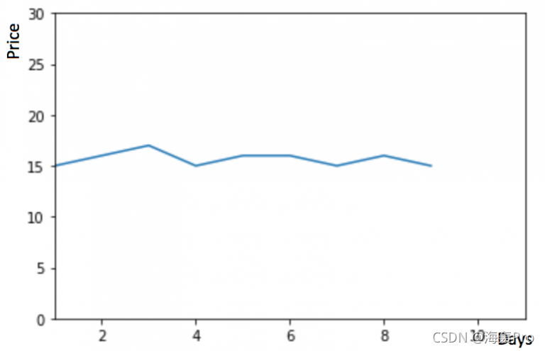 如果数据集在一段时间内都很稳定,我们想预测第二天的价格,可以取前面一天的价格,预测第二天的值。这种假设第一个预测点和上一个观察点相等的预测方法就叫朴素法

1 | dd = np.asarray(train['Count']) |
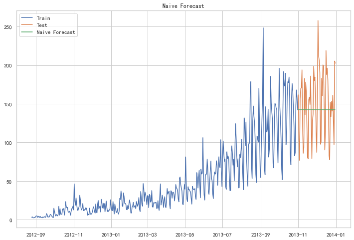
朴素法并不适合变化很大的数据集,最适合稳定性很高的数据集。我们计算下均方根误差,检查模型在测试数据集上的准确率:
1 | from sklearn.metrics import mean_squared_error |
43.91640614391676最终均方根误差RMS为:43.91640614391676
简单平均法
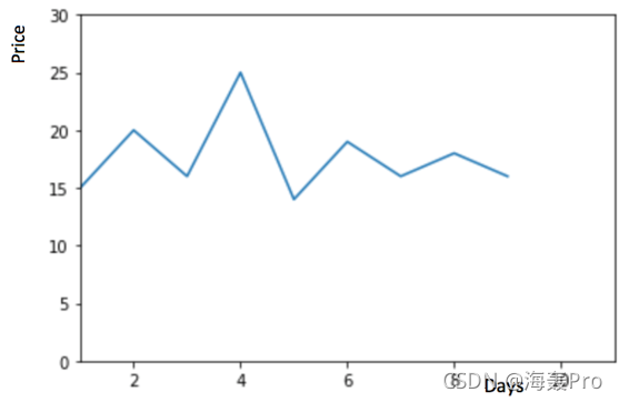
物品价格会随机上涨和下跌,平均价格会保持一致。我们经常会遇到一些数据集,虽然在一定时期内出现小幅变动,但每个时间段的平均值确实保持不变。这种情况下,我们可以预测出第二天的价格大致和过去天数的价格平均值一致。这种将预期值等同于之前所有观测点的平均值的预测方法就叫简单平均法

1 | y_hat_avg = test.copy() |
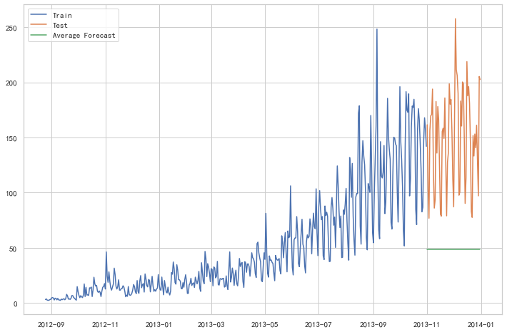
1 | from sklearn.metrics import mean_squared_error |
109.88526527082863这种模型并没有改善准确率。因此我们可以从中推断出当每个时间段的平均值保持不变时,这种 方法的效果才能达到最好。虽然朴素法的准确率高于简单平均法,但这并不意味着朴素法在所有 的数据集上都比简单平均法好
移动平均法
 物品价格在一段时间内大幅上涨,但后来又趋于平稳。我们也经常会遇到这种数据集,比如价格或销售额某段时间大幅上升或下降。如果我们这时用之前的简单平均法,就得使用所有先前数据的平均值,但在这里使用之前的所有数据是说不通的,因为用开始阶段的价格值会大幅影响接下来日期的预测值。因此,我们只取最近几个时期的价格平均值。很明显这里的逻辑是只有最近的值最要紧。这种用某些窗口期计算平均值的预测方法就叫移动平均法。
 移动平均法实际很有效,特别是当你为时序选择了正确的p值时
1 | y_hat_avg = test.copy() |
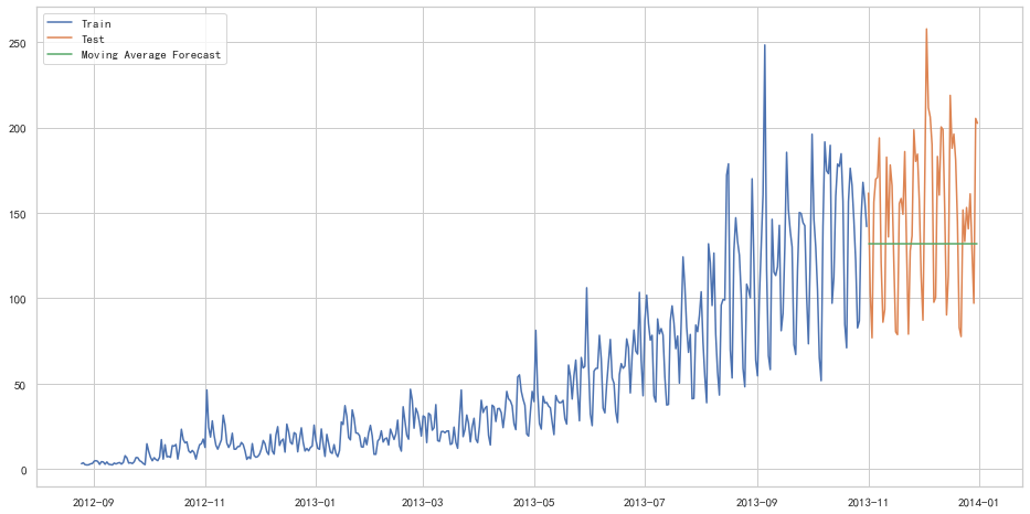
1 | from sklearn.metrics import mean_squared_error |
46.72840725106963我们可以看到,对于这个数据集,朴素法比简单平均法和移动平均法的表现要好。此外,我们还可以试试简单指数平滑法,它比移动平均法的一个进步之处就是相当于对移动平均法进行了加权。在上文移动平均法可以看到,我们对“p”中的观察值赋予了同样的权重。但是我们可能遇到一些情况,比如“p”中每个观察值会以不同的方式影响预测结果。将过去观察值赋予不同权重的方法就叫做加权移动平均法。加权移动平均法其实还是一种移动平均法,只是“滑动窗口期”内的值被赋予不同的权重,通常来讲,最近时间点的值发挥的作用更大了。
 这种方法并非选择一个窗口期的值,而是需要一列权重值(相加后为1)。例如,如果我们选择[0.40,
0.25, 0.20,
0.15]作为权值,我们会为最近的4个时间点分别赋给40%,25%,20%和15%的权重。
这种方法并非选择一个窗口期的值,而是需要一列权重值(相加后为1)。例如,如果我们选择[0.40,
0.25, 0.20,
0.15]作为权值,我们会为最近的4个时间点分别赋给40%,25%,20%和15%的权重。
简单指数平滑法
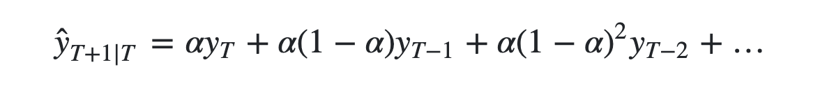
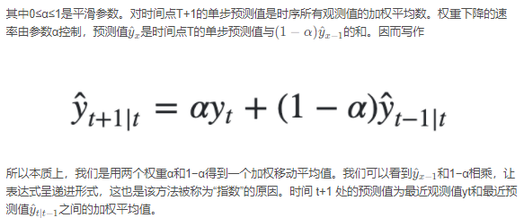
我们注意到简单平均法和加权移动平均法在选取时间点的思路上存在较大的差异。我们就需要在这两种方法之间取一个折中的方法,在将所有数据考虑在内的同时也能给数据赋予不同非权重。例如,相比更早时期内的观测值,它会给近期的观测值赋予更大的权重。按照这种原则工作的方法就叫做简单指数平滑法。它通过加权平均值计算出预测值,其中权重随着观测值从早期到晚期的变化呈指数级下降,最小的权重和最早的观测值相关:
1 | from statsmodels.tsa.api import SimpleExpSmoothing |
1 | from sklearn.metrics import mean_squared_error |
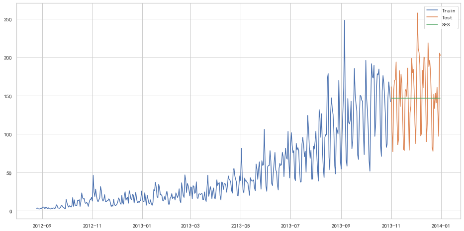
43.357625225228155以上几种模型似乎效果都不太好hhh
霍尔特线性趋势法
如果物品的价格是不断上涨的,我们上面的方法并没有考虑这种趋势,即我们在一段时间内观察到的价格的总体模式。在上图例子中,我们可以看到物品的价格呈上涨趋势。虽然上面这些方法都可以应用于这种趋势,但我们仍需要一种方法可以在无需假设的情况下,准确预测出价格趋势。这种考虑到数据集变化趋势的方法就叫做霍尔特线性趋势法。
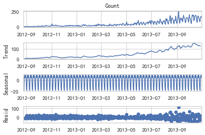
每个时序数据集可以分解为相应的几个部分:趋势(Trend),季节性(Seasonal)和残差(Residual)。任何呈现某种趋势的数据集都可以用霍尔特线性趋势法用于预测。
1 | import statsmodels.api as sm |
我们从图中可以看出,该数据集呈上升趋势。因此我们可以用霍尔特线性趋势法预测未来价格。该算法包含三个方程:一个水平方程,一个趋势方程,一个方程将二者相加以得到预测值y^
我们在上面算法中预测的值称为水平(level)。正如简单指数平滑一样,这里的水平方程显示它是观测值和样本内单步预测值的加权平均数,趋势方程显示它是根据 ℓ(t)−ℓ(t−1) 和之前的预测趋势 b(t−1) 在时间t处的预测趋势的加权平均值。
我们将这两个方程相加,得出一个预测函数。我们也可以将两者相乘而不是相加得到一个乘法预测方程。当趋势呈线性增加和下降时,我们用相加得到的方程;当趋势呈指数级增加或下降时,我们用相乘得到的方程。实践操作显示,用相乘得到的方程,预测结果会更稳定,但用相加得到的方程,更容易理解。
1 | from statsmodels.tsa.api import Holt |

1 | from sklearn.metrics import mean_squared_error |
43.056259611507286Holt-Winters季节性预测模型
在应用这种算法前,我们先介绍一个新术语。假如有家酒店坐落在半山腰上,夏季的时候生意很好,顾客很多,但每年其余时间顾客很少。因此,每年夏季的收入会远高于其它季节,而且每年都是这样,那么这种重复现象叫做“季节性”(Seasonality)。如果数据集在一定时间段内的固定区间内呈现相似的模式,那么该数据集就具有季节性
 我们之前讨论的5种模型在预测时并没有考虑到数据集的季节性,因此我们需要一种能考虑这种因素的方法。应用到这种情况下的算法就叫做Holt-Winters季节性预测模型,它是一种三次指数平滑预测,其背后的理念就是除了水平和趋势外,还将指数平滑应用到季节分量上。
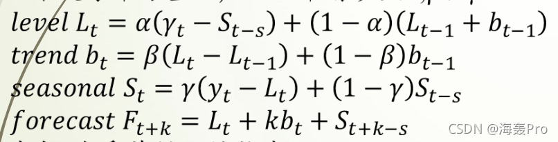 其中 s 为季节循环的长度,0≤α≤ 1, 0 ≤β≤ 1 , 0≤γ≤
1。水平函数为季节性调整的观测值和时间点t处非季节预测之间的加权平均值。趋势函数和霍尔特线性方法中的含义相同。季节函数为当前季节指数和去年同一季节的季节性指数之间的加权平均值。
其中 s 为季节循环的长度,0≤α≤ 1, 0 ≤β≤ 1 , 0≤γ≤
1。水平函数为季节性调整的观测值和时间点t处非季节预测之间的加权平均值。趋势函数和霍尔特线性方法中的含义相同。季节函数为当前季节指数和去年同一季节的季节性指数之间的加权平均值。
在本算法,我们同样可以用相加和相乘的方法。当季节性变化大致相同时,优先选择相加方法,而当季节变化的幅度与各时间段的水平成正比时,优先选择相乘的方法。
1 | from statsmodels.tsa.api import ExponentialSmoothing |
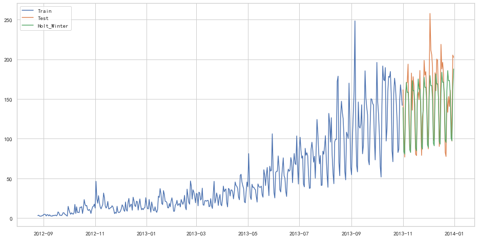
1 | from sklearn.metrics import mean_squared_error |
25.26498570407121自回归移动平均模型(ARIMA)
另一个场景的时序模型是自回归移动平均模型(ARIMA)。指数平滑模型都是基于数据中的趋势和季节性的描述,而自回归移动平均模型的目标是描述数据中彼此之间的关系。ARIMA的一个优化版就是季节性ARIMA。它像Holt-Winters季节性预测模型一样,也把数据集的季节性考虑在内。
1 | import statsmodels.api as sm |
D:\ProgramData\Anaconda3\lib\site-packages\statsmodels\base\model.py:566: ConvergenceWarning: Maximum Likelihood optimization failed to converge. Check mle_retvals
  warnings.warn("Maximum Likelihood optimization failed to "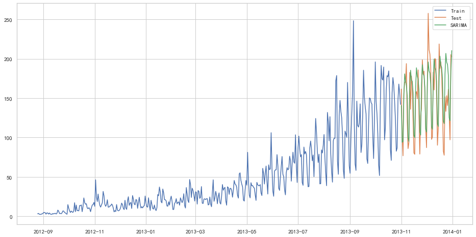
1 | from sklearn.metrics import mean_squared_error |
26.043525937455975随机序列
创建时间序列
date_range
- 可以指定开始时间与周期
- H:小时
- D:天
- M:月 从2016-07-01开始,周期为10,间隔为3天,生成的时间序列为下:
1 | import pandas as pd |
DatetimeIndex(['2016-07-01', '2016-07-04', '2016-07-07', '2016-07-10',
               '2016-07-13', '2016-07-16', '2016-07-19', '2016-07-22',
               '2016-07-25', '2016-07-28'],
              dtype='datetime64[ns]', freq='3D')
在Series中,指定index,将时间作为索引,产生随机序列:
1 | time=pd.Series(np.random.randn(20), |
2016-01-01    0.097992
2016-01-02   -0.404909
2016-01-03    0.653857
2016-01-04   -0.002989
2016-01-05    0.364106
2016-01-06   -0.240264
2016-01-07   -1.215996
2016-01-08    1.241052
2016-01-09    0.837406
2016-01-10   -1.280999
2016-01-11    0.590210
2016-01-12   -1.563861
2016-01-13    0.177527
2016-01-14   -1.851483
2016-01-15    0.590123
2016-01-16   -1.381618
2016-01-17    2.185482
2016-01-18   -2.144004
2016-01-19   -1.218511
2016-01-20   -0.960300
Freq: D, dtype: float64
truncate过滤
过滤掉2016-1-10之前的数据:
1 | time.truncate(before='2016-1-10') |
2016-01-10   -1.280999
2016-01-11    0.590210
2016-01-12   -1.563861
2016-01-13    0.177527
2016-01-14   -1.851483
2016-01-15    0.590123
2016-01-16   -1.381618
2016-01-17    2.185482
2016-01-18   -2.144004
2016-01-19   -1.218511
2016-01-20   -0.960300
Freq: D, dtype: float64
过滤掉2016-1-10之后的数据:
1 | time.truncate(after='2016-1-10') |
2016-01-01    0.097992
2016-01-02   -0.404909
2016-01-03    0.653857
2016-01-04   -0.002989
2016-01-05    0.364106
2016-01-06   -0.240264
2016-01-07   -1.215996
2016-01-08    1.241052
2016-01-09    0.837406
2016-01-10   -1.280999
Freq: D, dtype: float64
通过时间索引,提取数据:
1 | print(time['2016-01-15']) |
0.5901226225267066指定起始时间和终止时间,产生时间序列:
1 | data=pd.date_range('2010-01-01','2011-01-01',freq='M') |
DatetimeIndex(['2010-01-31', '2010-02-28', '2010-03-31', '2010-04-30',
               '2010-05-31', '2010-06-30', '2010-07-31', '2010-08-31',
               '2010-09-30', '2010-10-31', '2010-11-30', '2010-12-31'],
              dtype='datetime64[ns]', freq='M')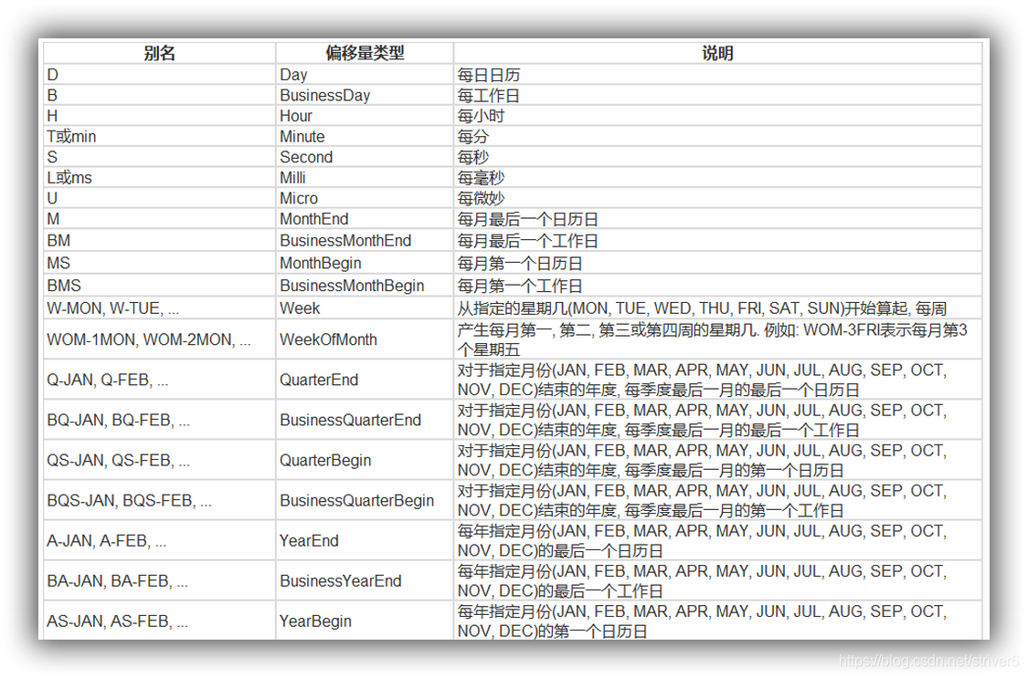
时间戳
1 | pd.Timestamp('2016-07-10') |
Timestamp('2016-07-10 00:00:00')可以指定更多细节
1 | pd.Timestamp('2016-07-10 10') |
Timestamp('2016-07-10 10:00:00')1 | pd.Timestamp('2016-07-10 10:15') |
Timestamp('2016-07-10 10:15:00')1 | t = pd.Timestamp('2016-07-10 10:15:19') |
Timestamp('2016-07-10 10:15:19')时间区间
1 | pd.Period('2016-01') |
Period('2016-01', 'M')1 | pd.Period('2016-01-01') |
Period('2016-01-01', 'D')时间加减
TIME OFFSETS
产生一个一天的时间偏移量:
1 | pd.Timedelta('1 day') |
Timedelta('1 days 00:00:00')得到2016-01-01 10:10的后一天时刻:
1 | pd.Period('2016-01-01 10:10') + pd.Timedelta('1 day') |
Period('2016-01-02 10:10', 'T')时间戳加减
1 | pd.Timestamp('2016-01-01 10:10') + pd.Timedelta('1 day') |
Timestamp('2016-01-02 10:10:00')加15 ns:
1 | pd.Timestamp('2016-01-01 10:10') + pd.Timedelta('15 ns') |
Timestamp('2016-01-01 10:10:00.000000015')在时间间隔刹参数中,我们既可以写成25H,也可以写成1D1H这种通俗的表达:
1 | p1 = pd.period_range('2016-01-01 10:10', freq = '25H', periods = 10) |
1 | p1 |
PeriodIndex(['2016-01-01 10:00', '2016-01-02 11:00', '2016-01-03 12:00',
             '2016-01-04 13:00', '2016-01-05 14:00', '2016-01-06 15:00',
             '2016-01-07 16:00', '2016-01-08 17:00', '2016-01-09 18:00',
             '2016-01-10 19:00'],
            dtype='period[25H]', freq='25H')
1 | p2 |
PeriodIndex(['2016-01-01 10:00', '2016-01-02 11:00', '2016-01-03 12:00',
'2016-01-04 13:00', '2016-01-05 14:00', '2016-01-06 15:00',
'2016-01-07 16:00', '2016-01-08 17:00', '2016-01-09 18:00',
'2016-01-10 19:00'],
dtype='period[25H]', freq='25H')指定索引
1 | rng = pd.date_range('2016 Jul 1', periods = 10, freq = 'D') |
2016-07-01 0
2016-07-02 1
2016-07-03 2
2016-07-04 3
2016-07-05 4
2016-07-06 5
2016-07-07 6
2016-07-08 7
2016-07-09 8
2016-07-10 9
Freq: D, dtype: int64构造任意的Series结构时间序列数据:
1 | periods = [pd.Period('2016-01'), pd.Period('2016-02'), pd.Period('2016-03')] |
2016-01 -0.044480
2016-02 0.816341
2016-03 -0.875320
Freq: M, dtype: float641 | type(ts.index) |
pandas.core.indexes.period.PeriodIndex时间戳和时间周期可以转换
1 | ts = pd.Series(range(10), pd.date_range('07-10-16 8:00', periods = 10, freq = 'H')) |
2016-07-10 08:00:00 0
2016-07-10 09:00:00 1
2016-07-10 10:00:00 2
2016-07-10 11:00:00 3
2016-07-10 12:00:00 4
2016-07-10 13:00:00 5
2016-07-10 14:00:00 6
2016-07-10 15:00:00 7
2016-07-10 16:00:00 8
2016-07-10 17:00:00 9
Freq: H, dtype: int64将时间周期转化为时间戳:
1 | ts_period = ts.to_period() |
2016-07-10 08:00 0
2016-07-10 09:00 1
2016-07-10 10:00 2
2016-07-10 11:00 3
2016-07-10 12:00 4
2016-07-10 13:00 5
2016-07-10 14:00 6
2016-07-10 15:00 7
2016-07-10 16:00 8
2016-07-10 17:00 9
Freq: H, dtype: int64时间周期和时间戳区别:
对时间周期的切片操作:
1 | ts_period['2016-07-10 08:30':'2016-07-10 11:45'] |
2016-07-10 08:00 0
2016-07-10 09:00 1
2016-07-10 10:00 2
2016-07-10 11:00 3
Freq: H, dtype: int64对时间戳的切片操作结果:
1 | ts['2016-07-10 08:30':'2016-07-10 11:45'] |
2016-07-10 09:00:00 1
2016-07-10 10:00:00 2
2016-07-10 11:00:00 3
Freq: H, dtype: int64数据重采样
- 时间数据由一个频率转换到另一个频率
- 降采样:例如将365天数据变为12个月数据
- 升采样:相反
从1/1/2011开始,时间间隔为1天,产生90个时间数据:
1 | import pandas as pd |
2011-01-01 1.160658
2011-01-02 0.691987
2011-01-03 0.204438
2011-01-04 -1.703135
2011-01-05 1.090152
Freq: D, dtype: float64降采样
将以上数据降采样为月数据,观察每个月数据之和:
1 | ts.resample('M').sum() |
2011-01-31 3.166377
2011-02-28 2.807078
2011-03-31 -3.865396
Freq: M, dtype: float64降采样为3天,并求和:
1 | ts.resample('3D').sum() |
2011-01-01 2.057084
2011-01-04 1.154984
2011-01-07 2.868148
2011-01-10 -0.244841
2011-01-13 -0.279276
2011-01-16 0.669061
2011-01-19 0.004282
2011-01-22 -1.647027
2011-01-25 -0.652588
2011-01-28 -0.387634
2011-01-31 0.009486
2011-02-03 0.168137
2011-02-06 0.849931
2011-02-09 -1.459601
2011-02-12 -0.636281
2011-02-15 -0.003550
2011-02-18 -0.869950
2011-02-21 1.558289
2011-02-24 0.864958
2011-02-27 2.460489
2011-03-02 -0.384647
2011-03-05 1.383810
2011-03-08 0.458777
2011-03-11 -2.690309
2011-03-14 0.693394
2011-03-17 0.821281
2011-03-20 -1.328988
2011-03-23 -0.177204
2011-03-26 -1.358276
2011-03-29 -1.793880
Freq: 3D, dtype: float64计算降采样后数据均值:
1 | day3Ts = ts.resample('3D').mean() |
2011-01-01 0.685695
2011-01-04 0.384995
2011-01-07 0.956049
2011-01-10 -0.081614
2011-01-13 -0.093092
2011-01-16 0.223020
2011-01-19 0.001427
2011-01-22 -0.549009
2011-01-25 -0.217529
2011-01-28 -0.129211
2011-01-31 0.003162
2011-02-03 0.056046
2011-02-06 0.283310
2011-02-09 -0.486534
2011-02-12 -0.212094
2011-02-15 -0.001183
2011-02-18 -0.289983
2011-02-21 0.519430
2011-02-24 0.288319
2011-02-27 0.820163
2011-03-02 -0.128216
2011-03-05 0.461270
2011-03-08 0.152926
2011-03-11 -0.896770
2011-03-14 0.231131
2011-03-17 0.273760
2011-03-20 -0.442996
2011-03-23 -0.059068
2011-03-26 -0.452759
2011-03-29 -0.597960
Freq: 3D, dtype: float64升采样
直接升采样是有问题的,因为有数据缺失:
1 | print(day3Ts.resample('D').asfreq()) |
2011-01-01 0.685695
2011-01-02 NaN
2011-01-03 NaN
2011-01-04 0.384995
2011-01-05 NaN
...
2011-03-25 NaN
2011-03-26 -0.452759
2011-03-27 NaN
2011-03-28 NaN
2011-03-29 -0.597960
Freq: D, Length: 88, dtype: float64需要进行插值
插值方法
- ffill 空值取前面的值
- bfill 空值取后面的值
- interpolate 线性取值
使用ffill插值:
1 | day3Ts.resample('D').ffill(1) |
2011-01-01 0.685695
2011-01-02 0.685695
2011-01-03 NaN
2011-01-04 0.384995
2011-01-05 0.384995
...
2011-03-25 NaN
2011-03-26 -0.452759
2011-03-27 -0.452759
2011-03-28 NaN
2011-03-29 -0.597960
Freq: D, Length: 88, dtype: float64使用bfill插值:
1 | day3Ts.resample('D').bfill(1) |
2011-01-01 0.685695
2011-01-02 NaN
2011-01-03 0.384995
2011-01-04 0.384995
2011-01-05 NaN
...
2011-03-25 -0.452759
2011-03-26 -0.452759
2011-03-27 NaN
2011-03-28 -0.597960
2011-03-29 -0.597960
Freq: D, Length: 88, dtype: float64使用interpolate线性取值:
1 | day3Ts.resample('D').interpolate('linear') |
2011-01-01 0.685695
2011-01-02 0.585461
2011-01-03 0.485228
2011-01-04 0.384995
2011-01-05 0.575346
...
2011-03-25 -0.321528
2011-03-26 -0.452759
2011-03-27 -0.501159
2011-03-28 -0.549560
2011-03-29 -0.597960
Freq: D, Length: 88, dtype: float64Pandas滑动窗口
为了提升数据的准确性,将某个点的取值扩大到包含这个点的一段区间,用区间来进行判断,这个区间就是窗口。例如想使用2011年1月1日的一个数据,单取这个时间点的数据当然是可行的,但是太过绝对,有没有更好的办法呢?可以选取2010年12月16日到2011年1月15日,通过求均值来评估1月1日这个点的值,2010-12-16到2011-1-15就是一个窗口,窗口的长度window=30.
移动窗口就是窗口向一端滑行,默认是从右往左,每次滑行并不是区间整块的滑行,而是一个单位一个单位的滑行。例如窗口2010-12-16到2011-1-15,下一个窗口并不是2011-1-15到2011-2-15,而是2010-12-17到2011-1-16(假设数据的截取是以天为单位),整体向右移动一个单位,而不是一个窗口。这样统计的每个值始终都是30单位的均值。
也就是我们在统计学中的移动平均法。
1 | %matplotlib inline |
指定600个数据的序列:
1 | df = pd.Series(np.random.randn(600), index = pd.date_range('7/1/2016', freq = 'D', periods = 600)) |
1 | df.head() |
2016-07-01 -0.107912
2016-07-02 -0.751786
2016-07-03 -1.188762
2016-07-04 -1.889090
2016-07-05 0.054006
Freq: D, dtype: float64指定该序列一个单位长度为10的滑块
1 | r = df.rolling(window = 10) |
Rolling [window=10,center=False,axis=0]输出滑块内的平均值,窗口中的值从覆盖整个窗口的位置开始产生,在此之前即为NaN,举例如下:窗口大小为10,前9个都不足够为一个一个窗口的长度,因此都无法取值
1 | #r.max, r.median, r.std, r.skew, r.sum, r.var |
2016-07-01 NaN
2016-07-02 NaN
2016-07-03 NaN
2016-07-04 NaN
2016-07-05 NaN
...
2018-02-16 0.042507
2018-02-17 -0.016247
2018-02-18 -0.126695
2018-02-19 -0.102721
2018-02-20 -0.283708
Freq: D, Length: 600, dtype: float64通过画图库来看原始序列与滑动窗口产生序列的关系图,原始数据用红色表示,移动平均后数据用蓝色点表示:
1 | import matplotlib.pyplot as plt |
<matplotlib.axes._subplots.AxesSubplot at 0x242d88e86d0>
可以看到,原始值浮动差异较大,而移动平均后数值较为平稳
数据平稳性与差分法
平稳性:
平稳性就是要求经由样本时间序列所得到的拟合曲线在未来的一段期间内仍能顺着现有的形态“惯性”地延续下去 平稳性要求序列的均值和方差不发生明显变化 严平稳与弱平稳:
严平稳:严平稳表示的分布不随时间的改变而改变。 如:白噪声(正态),无论怎么取,都是期望为0,方差为1 弱平稳:期望与相关系数(依赖性)不变 未来某时刻的t的值Xt就要依赖于它的过去信息,所以需要依赖性
差分法:时间序列在t与t-1时刻的差值: 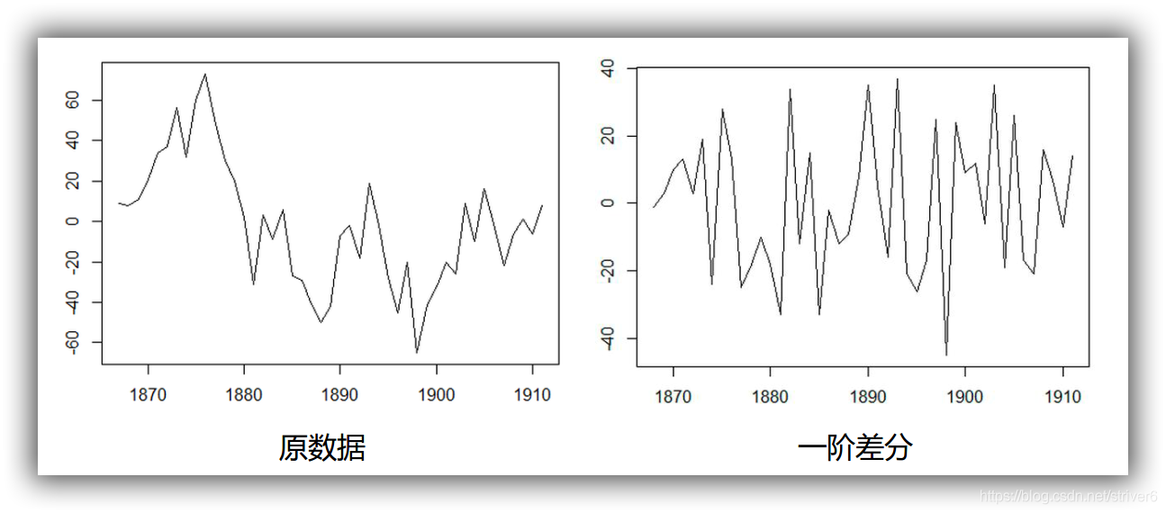
1 | %load_ext autoreload |
读取数据
1 | Sentiment = 'data/sentiment.csv' |
| UMCSENT | |
|---|---|
| DATE | |
| 2000-01-01 | 112.00000 |
| 2000-02-01 | 111.30000 |
| 2000-03-01 | 107.10000 |
| 2000-04-01 | 109.20000 |
| 2000-05-01 | 110.70000 |
| ... | ... |
| 2016-03-01 | 91.00000 |
| 2016-04-01 | 89.00000 |
| 2016-05-01 | 94.70000 |
| 2016-06-01 | 93.50000 |
| 2016-07-01 | 90.00000 |
199 rows × 1 columns
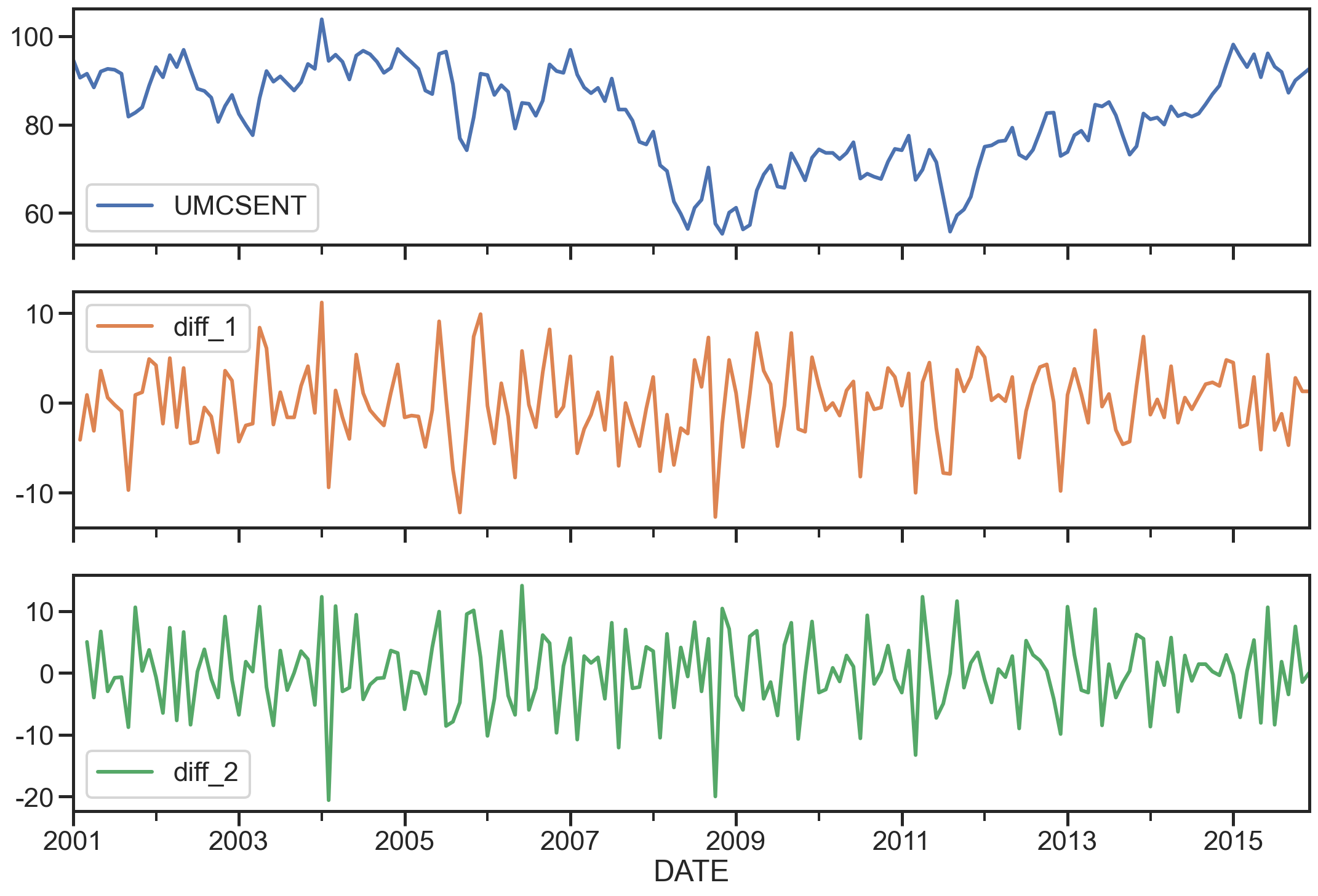
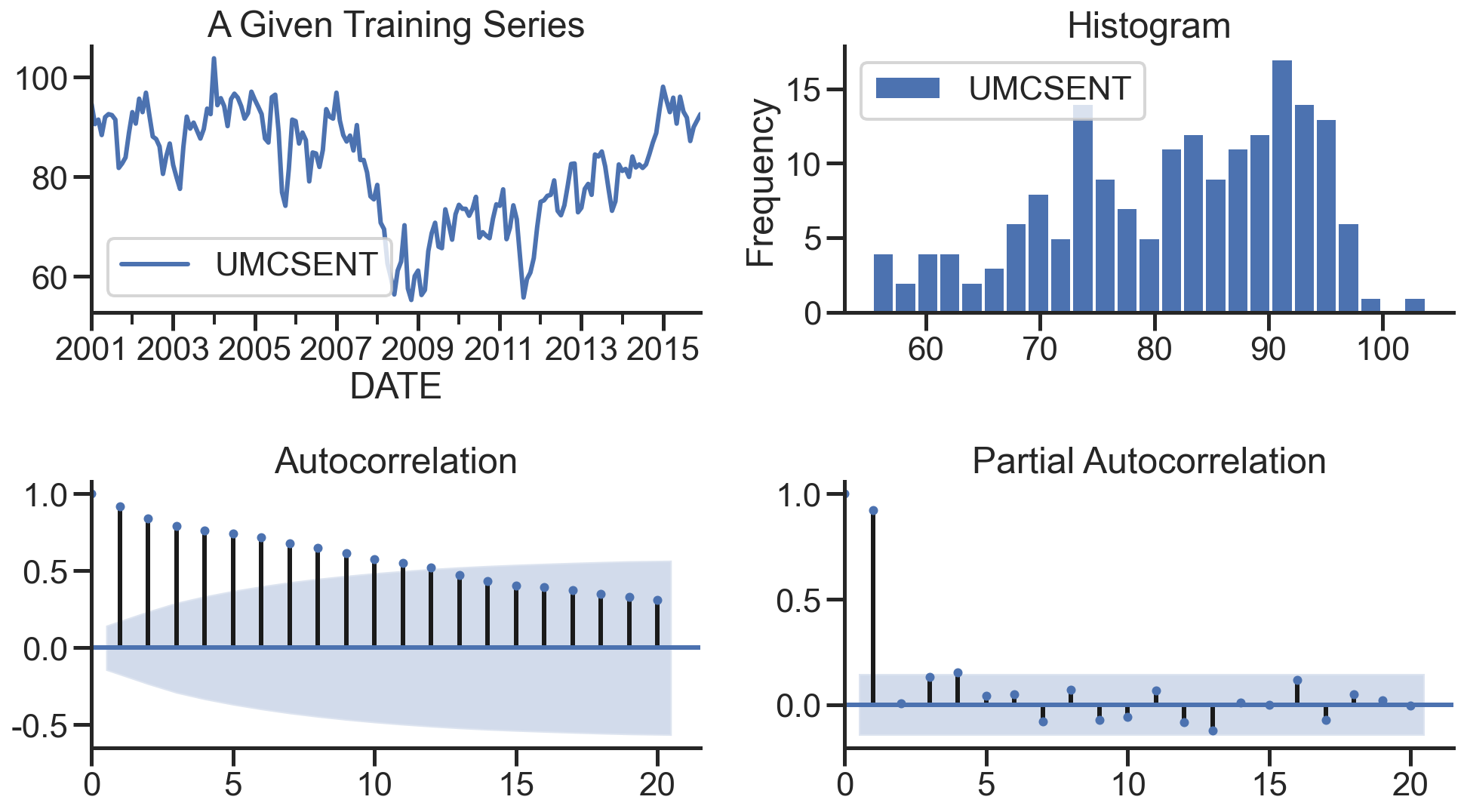
选择2001-2015的部分,画图
1 | sentiment_short = data.loc['2001':'2015'] |
UMCSENT diff_1 diff_2
DATE
2001-01-01 94.70000 NaN NaN
2001-02-01 90.60000 -4.10000 NaN
2001-03-01 91.50000 0.90000 5.00000
2001-04-01 88.40000 -3.10000 -4.00000
2001-05-01 92.00000 3.60000 6.70000
array([<matplotlib.axes._subplots.AxesSubplot object at 0x00000242D86F0A90>,
<matplotlib.axes._subplots.AxesSubplot object at 0x00000242D83458B0>,
<matplotlib.axes._subplots.AxesSubplot object at 0x00000242D8521D00>],
dtype=object)
ARIMA模型
AR模型
自回归模型(AR)
- 描述当前值与历史值之间的关系,用变量自身的历史时间数据对自身进行预测
- 自回归模型必须满足平稳性的要求
- p阶自回归过程的公式定义:
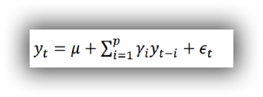
是当前值 是常数项 P 是阶数 是自相关系数 是误差
自回归模型的限制:
- 自回归模型是用自身的数据来进行预测
- 必须具有平稳性
- 必须具有自相关性,如果自相关系数(φi)小于0.5,则不宜采用
- 自回归只适用于预测与自身前期相关的现象
MA模型
移动平均模型(MA)
移动平均模型关注的是自回归模型中的误差项的累加
q阶自回归过程的公式定义:
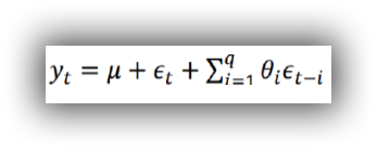
移动平均法能有效地消除预测中的随机波动
ARMA模型
自回归移动平均模型(ARMA)
自回归与移动平均的结合 公式定义: 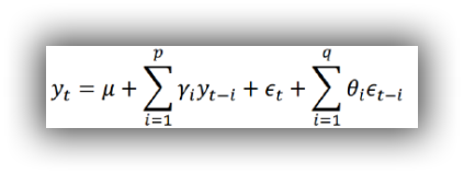
5.4 ARIMA模型 ARIMA(p,d,q)模型全称为差分自回归移动平均模型 (Autoregressive Integrated Moving Average Model,简记ARIMA)
- AR是自回归, p为自回归项; MA为移动平均q为移动平均项数,d为时间序列成为平稳时所做的差分次数,一般做一阶差分就够了,很少有做二阶差分的
- 原理:将非平稳时间序列转化为平稳时间序列然后将因变量仅对它的滞后值以及随机误差项的现值和滞后值进行回归所建立的模型
相关函数评估(选择p、q值)方法
自相关函数ACF(autocorrelation function)
有序的随机变量序列与其自身相比较自相关函数反映了同一序列在不同时序的取值之间的相关性
公式:
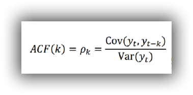
Pk的取值范围为[-1,1]
偏自相关函数(PACF)(partial autocorrelation function)
对于一个平稳AR§模型,求出滞后k自相关系数p(k)时实际上得到并不是x(t)与x(t-k)之间单纯的相关关系
x(t)同时还会受到中间k-1个随机变量x(t-1)、x(t-2)、……、x(t-k+1)的影响而这k-1个随机变量又都和x(t-k)具有相关关系,所以自相关系数p(k)里实际掺杂了其他变量对x(t)与x(t-k)的影响
剔除了中间k-1个随机变量x(t-1)、x(t-2)、……、x(t-k+1)的干扰之后x(t-k)对x(t)影响的相关程度。
ACF还包含了其他变量的影响而偏自相关系数PACF是严格这两个变量之间的相关性
ARIMA(p,d,q)阶数确定:
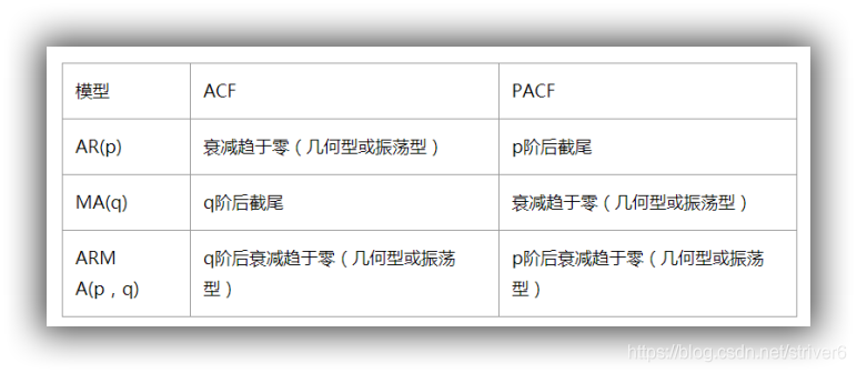
- 截尾:落在置信区间内(95%的点都符合该规则) ARIMA(p,d,q)阶数确定:
- AR§ 看PACF
- MA(q) 看ACF
利用AIC与BIC准则: 选择参数p、q
赤池信息准则(Akaike Information Criterion,AIC)
AIC是衡量统计模型拟合优良性的一种标准,由日本统计学家赤池弘次在1974年提出,它建立在熵的概念上,提供了权衡估计模型复杂度和拟合数据优良性的标准。
通常情况下,AIC定义为:

其中k是模型参数个数,L是似然函数。从一组可供选择的模型中选择最佳模型时,通常选择AIC最小的模型。
当两个模型之间存在较大差异时,差异主要体现在似然函数项,当似然函数差异不显著时,上式第一项,即模型复杂度则起作用,从而参数个数少的模型是较好的选择。
一般而言,当模型复杂度提高(k增大)时,似然函数L也会增大,从而使AIC变小,但是k过大时,似然函数增速减缓,导致AIC增大,模型过于复杂容易造成过拟合现象。
目标是选取AIC最小的模型,AIC不仅要提高模型拟合度(极大似然),而且引入了惩罚项,使模型参数尽可能少,有助于降低过拟合的可能性。
贝叶斯信息准则(Bayesian Information Criterion,BIC)
BIC(Bayesian
InformationCriterion)贝叶斯信息准则与AIC相似,用于模型选择,1978年由Schwarz提出。训练模型时,增加参数数量,也就是增加模型复杂度,会增大似然函数,但是也会导致过拟合现象,针对该问题,AIC和BIC均引入了与模型参数个数相关的惩罚项,BIC的惩罚项比AIC的大,考虑了样本数量,样本数量过多时,可有效防止模型精度过高造成的模型复杂度过高。

- 其中,k为模型参数个数,n为样本数量,L为似然函数。kln(n)惩罚项在维数过大且训练样本数据相对较少的情况下,可以有效避免出现维度灾难现象。
AIC与BIC比较
AIC和BIC的公式中前半部分是一样的,后半部分是惩罚项,当n≥8n≥8时,kln(n)≥2kkln(n)≥2k,所以,BIC相比AIC在大数据量时对模型参数惩罚得更多,导致BIC更倾向于选择参数少的简单模型。
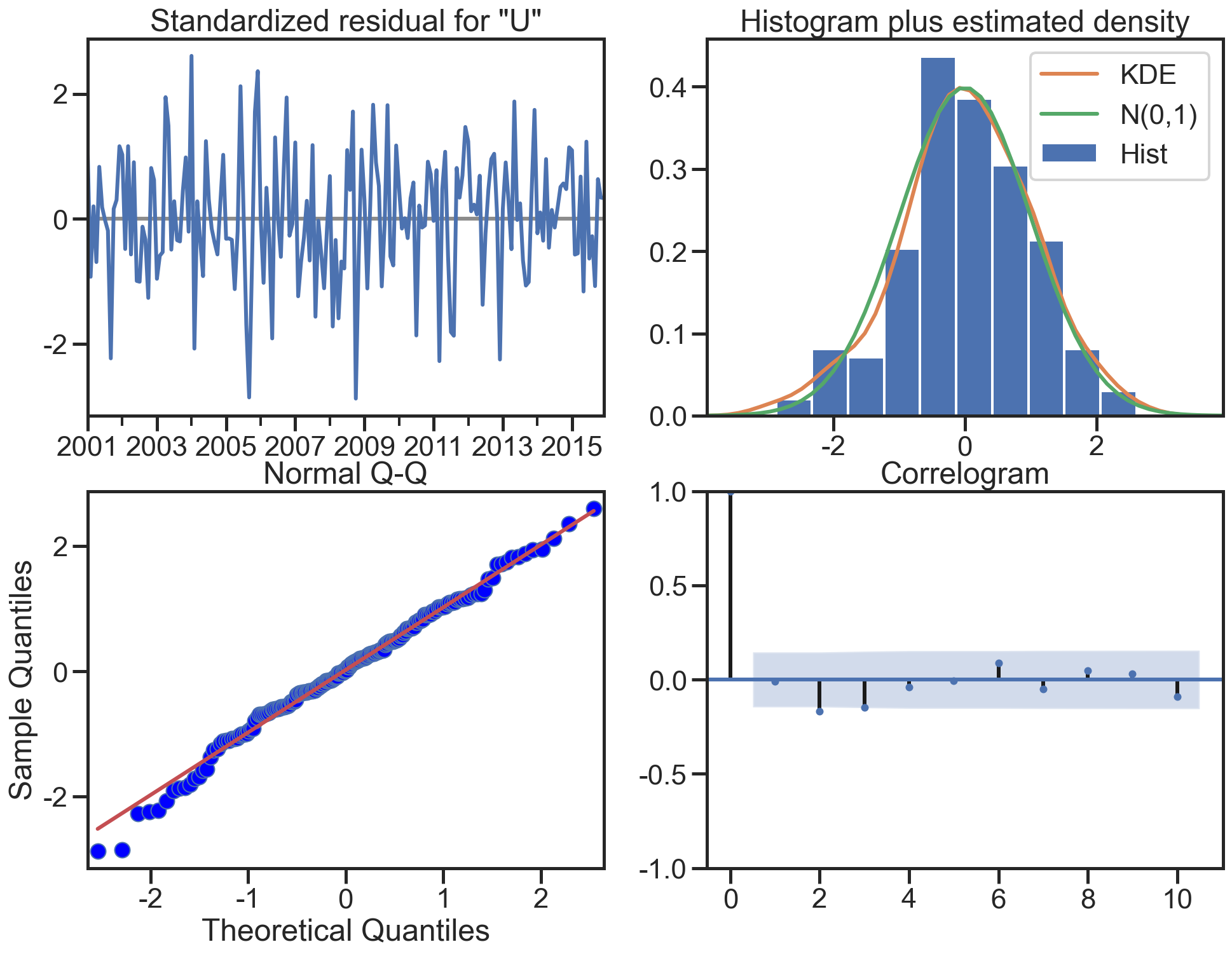
模型残差检验:
- ARIMA模型的残差是否是平均值为0且方差为常数的正态分布
- QQ图:线性即正态分布
ARIMA建模流程:
- 将序列平稳(差分法确定d)
- p和q阶数确定:ACF与PACF
- ARIMA(p,d,q)
实战分析
sentiment的ARIMA模型
1 | del sentiment_short['diff_2'] |
| UMCSENT | |
|---|---|
| DATE | |
| 2001-01-01 | 94.70000 |
| 2001-02-01 | 90.60000 |
| 2001-03-01 | 91.50000 |
| 2001-04-01 | 88.40000 |
| 2001-05-01 | 92.00000 |
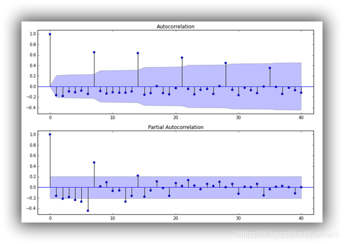
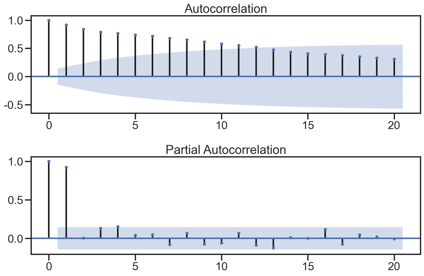
绘制ACF图、PACF图确定p、q值,其中阴影部分代表p、q的置信区间:
1 | fig = plt.figure(figsize=(12,8)) |
使用散点图绘制原始数据和k阶差分数据之间的关系,并求出相关系数:
1 | lags=9 |
*c* argument looks like a single numeric RGB or RGBA sequence, which should be avoided as value-mapping will have precedence in case its length matches with *x* & *y*. Please use the *color* keyword-argument or provide a 2-D array with a single row if you intend to specify the same RGB or RGBA value for all points.
*c* argument looks like a single numeric RGB or RGBA sequence, which should be avoided as value-mapping will have precedence in case its length matches with *x* & *y*. Please use the *color* keyword-argument or provide a 2-D array with a single row if you intend to specify the same RGB or RGBA value for all points.
*c* argument looks like a single numeric RGB or RGBA sequence, which should be avoided as value-mapping will have precedence in case its length matches with *x* & *y*. Please use the *color* keyword-argument or provide a 2-D array with a single row if you intend to specify the same RGB or RGBA value for all points.
*c* argument looks like a single numeric RGB or RGBA sequence, which should be avoided as value-mapping will have precedence in case its length matches with *x* & *y*. Please use the *color* keyword-argument or provide a 2-D array with a single row if you intend to specify the same RGB or RGBA value for all points.
*c* argument looks like a single numeric RGB or RGBA sequence, which should be avoided as value-mapping will have precedence in case its length matches with *x* & *y*. Please use the *color* keyword-argument or provide a 2-D array with a single row if you intend to specify the same RGB or RGBA value for all points.
*c* argument looks like a single numeric RGB or RGBA sequence, which should be avoided as value-mapping will have precedence in case its length matches with *x* & *y*. Please use the *color* keyword-argument or provide a 2-D array with a single row if you intend to specify the same RGB or RGBA value for all points.
*c* argument looks like a single numeric RGB or RGBA sequence, which should be avoided as value-mapping will have precedence in case its length matches with *x* & *y*. Please use the *color* keyword-argument or provide a 2-D array with a single row if you intend to specify the same RGB or RGBA value for all points.
*c* argument looks like a single numeric RGB or RGBA sequence, which should be avoided as value-mapping will have precedence in case its length matches with *x* & *y*. Please use the *color* keyword-argument or provide a 2-D array with a single row if you intend to specify the same RGB or RGBA value for all points.
*c* argument looks like a single numeric RGB or RGBA sequence, which should be avoided as value-mapping will have precedence in case its length matches with *x* & *y*. Please use the *color* keyword-argument or provide a 2-D array with a single row if you intend to specify the same RGB or RGBA value for all points.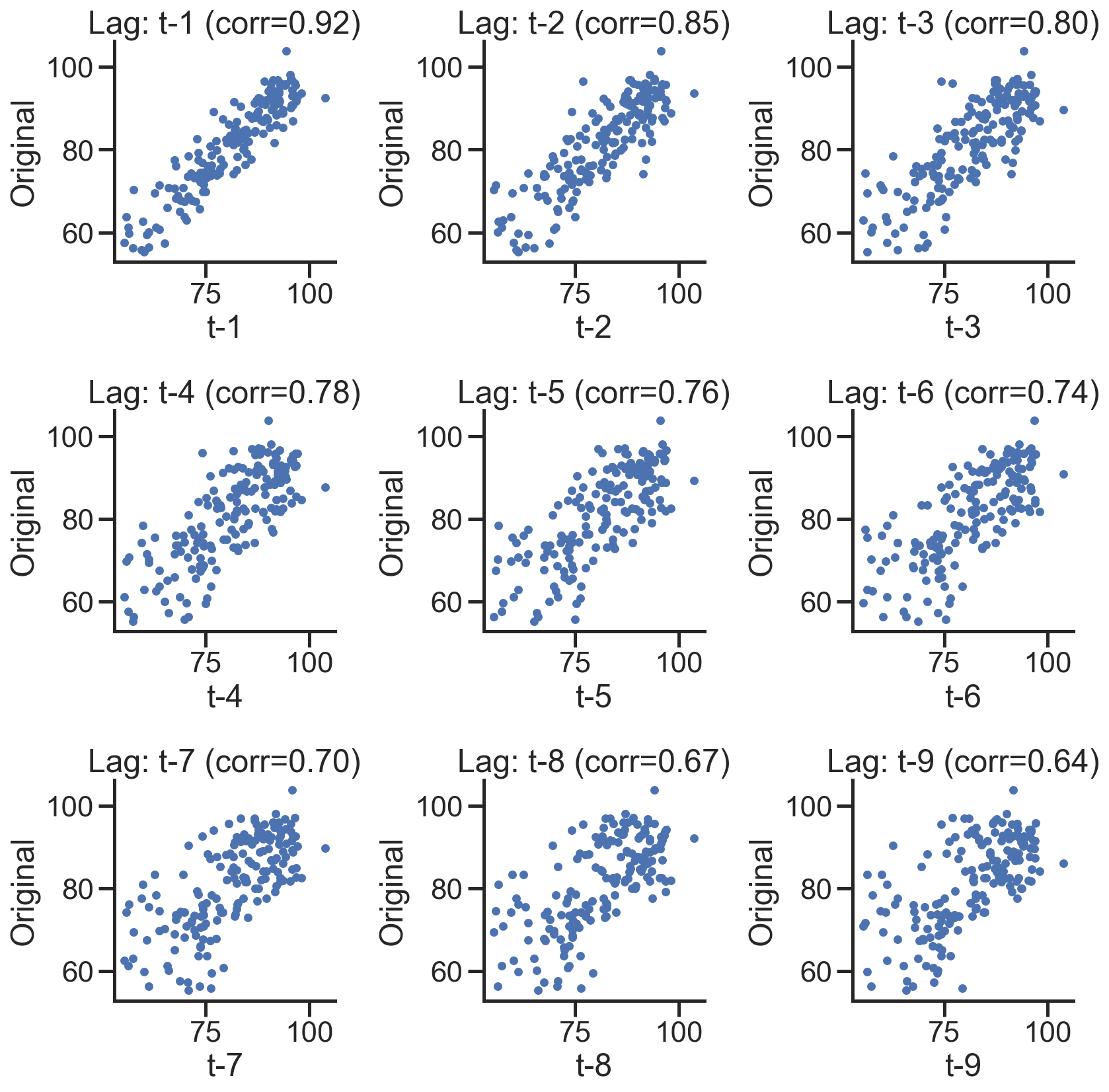
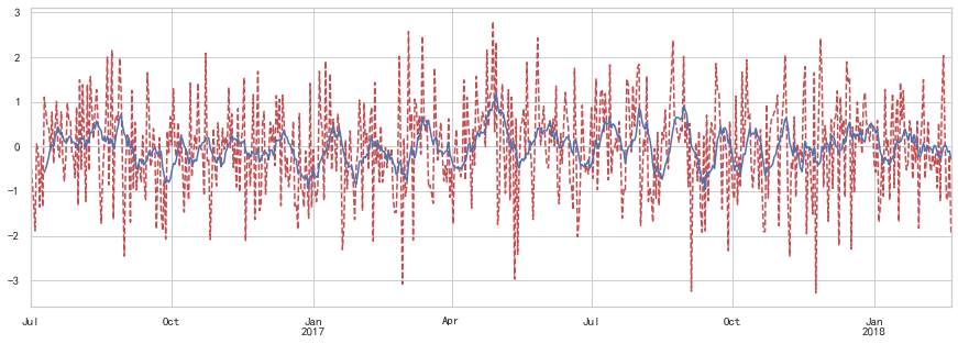
在下图,分别绘制原始数据的残差图、直方图、ACF图和PACF图:
1 | def tsplot(y, lags=None, title='', figsize=(14, 8)): |
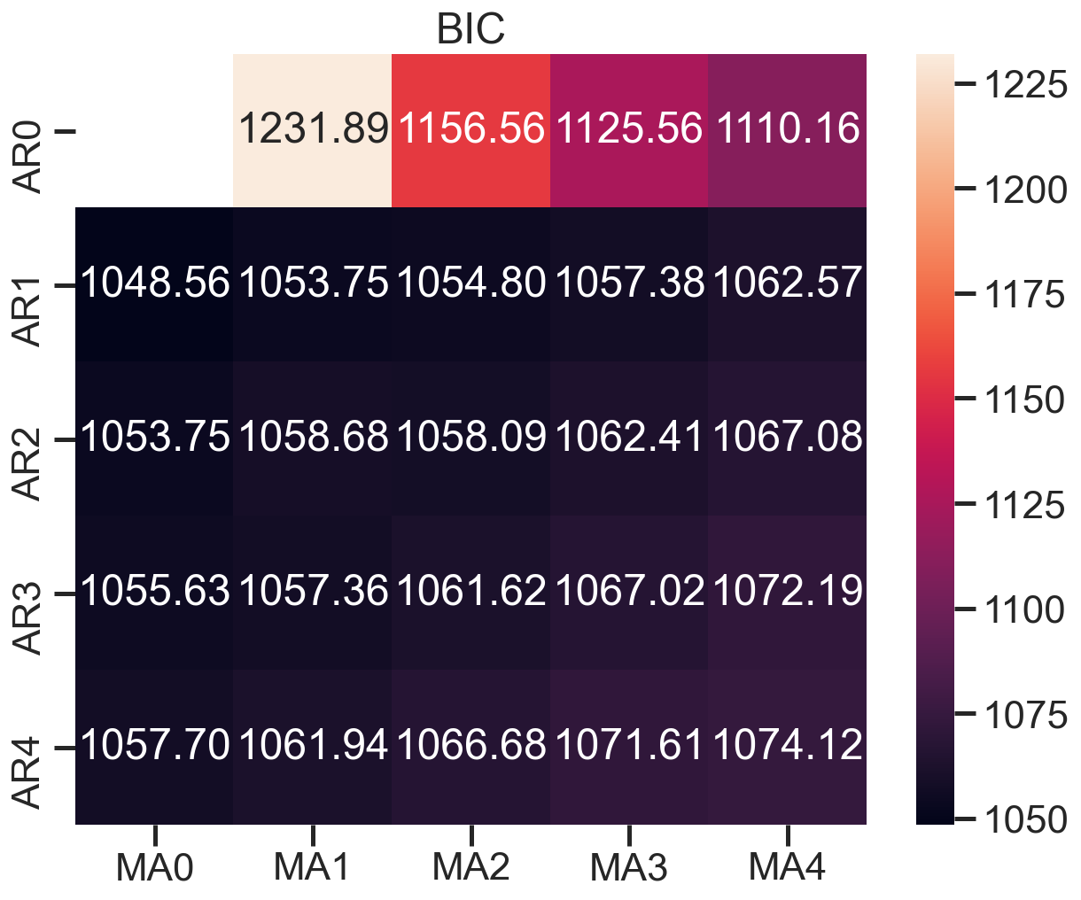
建立模型+参数选择(AIC、BIC):p范围[0 ,4],q范围[0, 4] d=0,遍历求最佳组合
1 | arima200 = sm.tsa.SARIMAX(sentiment_short, order=(2,0,0)) |
D:\ProgramData\Anaconda3\lib\site-packages\statsmodels\tsa\base\tsa_model.py:524: ValueWarning: No frequency information was provided, so inferred frequency MS will be used.
warnings.warn('No frequency information was'
D:\ProgramData\Anaconda3\lib\site-packages\statsmodels\tsa\base\tsa_model.py:524: ValueWarning: No frequency information was provided, so inferred frequency MS will be used.
warnings.warn('No frequency information was'
D:\ProgramData\Anaconda3\lib\site-packages\statsmodels\tsa\base\tsa_model.py:524: ValueWarning: No frequency information was provided, so inferred frequency MS will be used.
warnings.warn('No frequency information was'
D:\ProgramData\Anaconda3\lib\site-packages\statsmodels\tsa\base\tsa_model.py:524: ValueWarning: No frequency information was provided, so inferred frequency MS will be used.
warnings.warn('No frequency information was'
D:\ProgramData\Anaconda3\lib\site-packages\statsmodels\tsa\base\tsa_model.py:524: ValueWarning: No frequency information was provided, so inferred frequency MS will be used.
warnings.warn('No frequency information was'
D:\ProgramData\Anaconda3\lib\site-packages\statsmodels\tsa\base\tsa_model.py:524: ValueWarning: No frequency information was provided, so inferred frequency MS will be used.
warnings.warn('No frequency information was'
D:\ProgramData\Anaconda3\lib\site-packages\statsmodels\tsa\base\tsa_model.py:524: ValueWarning: No frequency information was provided, so inferred frequency MS will be used.
warnings.warn('No frequency information was'
D:\ProgramData\Anaconda3\lib\site-packages\statsmodels\tsa\base\tsa_model.py:524: ValueWarning: No frequency information was provided, so inferred frequency MS will be used.
warnings.warn('No frequency information was'
D:\ProgramData\Anaconda3\lib\site-packages\statsmodels\tsa\base\tsa_model.py:524: ValueWarning: No frequency information was provided, so inferred frequency MS will be used.
warnings.warn('No frequency information was'
D:\ProgramData\Anaconda3\lib\site-packages\statsmodels\tsa\base\tsa_model.py:524: ValueWarning: No frequency information was provided, so inferred frequency MS will be used.
warnings.warn('No frequency information was'
D:\ProgramData\Anaconda3\lib\site-packages\statsmodels\tsa\base\tsa_model.py:524: ValueWarning: No frequency information was provided, so inferred frequency MS will be used.
warnings.warn('No frequency information was'
D:\ProgramData\Anaconda3\lib\site-packages\statsmodels\tsa\base\tsa_model.py:524: ValueWarning: No frequency information was provided, so inferred frequency MS will be used.
warnings.warn('No frequency information was'
D:\ProgramData\Anaconda3\lib\site-packages\statsmodels\tsa\base\tsa_model.py:524: ValueWarning: No frequency information was provided, so inferred frequency MS will be used.
warnings.warn('No frequency information was'
D:\ProgramData\Anaconda3\lib\site-packages\statsmodels\tsa\base\tsa_model.py:524: ValueWarning: No frequency information was provided, so inferred frequency MS will be used.
warnings.warn('No frequency information was'
D:\ProgramData\Anaconda3\lib\site-packages\statsmodels\tsa\base\tsa_model.py:524: ValueWarning: No frequency information was provided, so inferred frequency MS will be used.
warnings.warn('No frequency information was'
D:\ProgramData\Anaconda3\lib\site-packages\statsmodels\tsa\base\tsa_model.py:524: ValueWarning: No frequency information was provided, so inferred frequency MS will be used.
warnings.warn('No frequency information was'
D:\ProgramData\Anaconda3\lib\site-packages\statsmodels\tsa\base\tsa_model.py:524: ValueWarning: No frequency information was provided, so inferred frequency MS will be used.
warnings.warn('No frequency information was'
D:\ProgramData\Anaconda3\lib\site-packages\statsmodels\tsa\base\tsa_model.py:524: ValueWarning: No frequency information was provided, so inferred frequency MS will be used.
warnings.warn('No frequency information was'
D:\ProgramData\Anaconda3\lib\site-packages\statsmodels\tsa\base\tsa_model.py:524: ValueWarning: No frequency information was provided, so inferred frequency MS will be used.
warnings.warn('No frequency information was'
D:\ProgramData\Anaconda3\lib\site-packages\statsmodels\tsa\base\tsa_model.py:524: ValueWarning: No frequency information was provided, so inferred frequency MS will be used.
warnings.warn('No frequency information was'
D:\ProgramData\Anaconda3\lib\site-packages\statsmodels\tsa\base\tsa_model.py:524: ValueWarning: No frequency information was provided, so inferred frequency MS will be used.
warnings.warn('No frequency information was'
D:\ProgramData\Anaconda3\lib\site-packages\statsmodels\tsa\base\tsa_model.py:524: ValueWarning: No frequency information was provided, so inferred frequency MS will be used.
warnings.warn('No frequency information was'
D:\ProgramData\Anaconda3\lib\site-packages\statsmodels\tsa\base\tsa_model.py:524: ValueWarning: No frequency information was provided, so inferred frequency MS will be used.
warnings.warn('No frequency information was'
D:\ProgramData\Anaconda3\lib\site-packages\statsmodels\tsa\base\tsa_model.py:524: ValueWarning: No frequency information was provided, so inferred frequency MS will be used.
warnings.warn('No frequency information was'
D:\ProgramData\Anaconda3\lib\site-packages\statsmodels\tsa\base\tsa_model.py:524: ValueWarning: No frequency information was provided, so inferred frequency MS will be used.
warnings.warn('No frequency information was'
D:\ProgramData\Anaconda3\lib\site-packages\statsmodels\tsa\base\tsa_model.py:524: ValueWarning: No frequency information was provided, so inferred frequency MS will be used.
warnings.warn('No frequency information was'画出BIC值热度图
1 | fig, ax = plt.subplots(figsize=(10, 8)) |
模型评估:残差分析 正态分布 QQ图线性
1 | model_results.plot_diagnostics(figsize=(16, 12)) |